|
|
Goal:
The Italian olive oil maker Olivio has
commissioned a design for a series of three new flavored olive
oil
products and wants a new label to appear on this brand
extension.
|
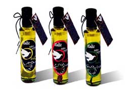
Concept:
The logo came from the idea of a peace sign: A pigeon holding olive leaf in its mouth, and I combined it with the
word "Olivio".
I have created a feeling of ancientness with the font because I want
the product to look elegant and historical.
The elements of designing a packaging series are
supposed to cooperate, not compete. So, I used three sharp colors, to
differentiate the flavors, in the border and title on the label. The black
background color and cap have created a very stylish contrast, which
have added a dash of modernity.
I have designed the neck leaflet as a rectangular card rather than
the custom booklet, due to the shape of the tall
bottles.
|
Background:
The manufacturer has been around for
centuries and wants a brand revolution. This is the final project of my graphic design
paper.
|
Materials
& Technique
3 250ml
glass bottles, 10x4cm cardboard, A4 paper.
The techniques of typography, layout
expertise, publishing, paper, packaging, and production expertise.
Photography and scanning techniques.
|
|
Click for larger
size and further Details
Olivio Olive Oil Bottles, Labels
and Leaflet |