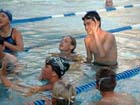
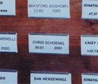
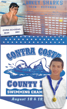
The photos (starting from top left and working clockwise: 1) I had to find
a great shot of my son. This one was given to me but he had on a black shirt;
2) The Larkey Sharks Team Records board with all the latest record breakers
since the club started in 1957; 3) Chris in the water and smiling; 4) his record
spot; 5) the program cover for the championship meet; 6) Chris with his medal
and that's not a great picture(I took it).
The Preliminaries:
First, gather the photos, images for your theme.
Secondly, identify the part of each photo that you want to focus on. Here's
where you "crop" out the fluff.
Thirdly, what's your real estate? How big do you want your final collage
to be?
Scan to create the images that you want to use.
The Procedure: Layer Set
Create a image 300x500 pixels, white background, 16 million colors (since
we are using photos).
Open the image of the kid in the black shirt and copy and paste into a new
layer. Using Masking, I isolated his body only. Using the magic wand, I recolorize
his shirt to white. While I work on the next layer, I click the eyeglasses
to hide it from view.
Open the image of Chris in plaid shirt; copy and paste into a new layer.
Using masking, I isolated the medal and ribbon. Using magic wand, I recolorize
the ribbon to a blue that matches the program cover. I apply a bright yellow
overlay on the medal so it looks brighter.
Since the medal goes on top of the shirt, make sure that layer is above
the layer with the "white" shirt. Using the arrow tool, I move it or resize
it so it is proportional to the torso.
Then I merge before putting a faint dropshadow behind my son. I am going
to group these two layers. While I work on the next layer, I click the eyeglasses
to hide it from view. Locking it helps, too.
The Procedure: Putting the Puzzle Pieces into Place
Layer 1-Background: I have decided to use the program manual cover as the
background since it states what the event is. I crop all the unnecessary edges
around it and place it on the pasteboard. I can move or resize it later.
Layer 2: Since the kid will be on top of the manual cover, I will drag that
layer set in. Worry about moving or resizing it later.
Layer 3: Since it is the second largest piece, I will work with the team
board next. Copy and paste it on another layer, above the program cover (background).
I resized it so it will overlap the program cover layer so slightly.
Layer 4: I cropped the photo of the swimmers so I only have my son. I am
copying and pasting into the next layer. To get rid of the background images,
I used the rubber stamper to clone the lane rope and water. I am putting it
into the upper leftmost corner. I am going to flip the image horizontally
so he faces the board. His image should overlap the board on the right just
a little bit.
Layer 5: I cropped the title card so I isolated the card only, cutting out
all the wood surrounding it. I skewed the card so it would move in the same
direction and angle as the kid's body.
Layer 6: I wanted to highlight where his title card was on that big board.
So on a new layer and with layer 3 visible, I drew a rectangle with the pen
tool and floodfilled with yellow. Couldn't see the text so I drew a few squiggly
lines to represent where the text is.
The Procedure: The Finishing Moves
Layer 1- Background: I sized the image of the cover to fill the entire
width and 2/3 of the page. The top border with the stars gives me room to
play with. I lighten the background (opacity) to 95%.
Layer 2- the kid: I didn't want Chris's image to take up too much space
on the cover since just enough text was important to see what the event was.
I resized him to what I felt was appropriate. I debated adjusting the opacity
so the text could shine thru but decided against it.
Layer 3 - the board: The board was too bold so I soften the opacity to 85%.
Using the rectangle selection tool, I feather the edges at 5 with anti-alias. I resized
it so it would barely overlap over the top of the manual.
Layer 4 - the kid waving: Using the rectangle selection tool again and feather at edges
with 20 and anti-alias, I sized the image to cover any white space between
the board.
Layer 5 - the title card: I lightly smudged the very edge to soften it.
I changed the opacity to 95%. I also resized it to fill in any empty spots
between the waving kid and the board to the right.
When the collage appears to my satisfaction, I can now safely merge/flatten
the image. But first, save the file in its native Paintshop Pro (.psp) in
case you want to rework it at a later date. After merging, I optimized it
as .jpg at 10% compression ( that looked best before any apparent resolution
degradation started appearing).
As you can see, I only used a few basic tools and techniques: copy & paste, layering, masking, the ellipse tool, feathering, merging and opacity adjustments. That's all. As the old adage goes, the best work shows when you use the KISS formula (Keep It So Simple).