| Home |
Store
Front |
Team
Project |
The following site is dedicated to the sites for the computer gaming companies that provide educational and fun and exciting games that aid in our kids developments. (YA RIGHT!!!) I owe many a hour to these guys for keeping me entertained on the long weekends when tiem seems to go nowhere and the next week never seems to arrive.
  5 out of 5
|
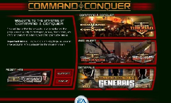
www.westwood.com First Impressions: My first impression of this web site was that it was organized by game, which made it easy to find out the information that you are looking for. The home page is very easy to navigate around for the set up is simple and is labeled in a very simple manner. Graphics on the web site are of a very good and professional quality. All graphics have a similar look to them, which gives the site on over all feel of neatness and togetherness. Navigation: The whole web site is set up in a very simple to use way. Many of the attached pages have lists down the left side for easy to access information. The navigation lists are also set up in easy to use manners and is organized in such a manner to fit each game and its corresponding web site. Problems: The main problem I encountered with the navigation of the site was that for one of the links, it took a while to get at the information that I was looking for. However once one gets past all the extra information and extra links, the information is easy to get a hold of. E-commerce: All games off of the Westwood site are not sold directly by Westwood. Instead they are all sold by EA Games, another big name in the PC gaming world. The whole process of buying a game is extremely secure and confidential. As an added safety feature one has to long on to the website to actually be able to make any kind of purchase. |
|
 5 out of 5 5 out of 5
|
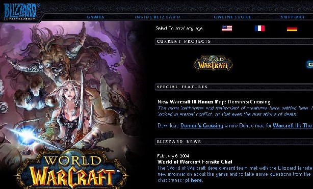
www.blizzard.com First Impression: My first impression of the site is that it too is also set up in a very organized and structured manner. It is laid out in a very to navigate manner with an exploration bar at the top of the site. The opening page appears very bleak and dark, except for the picture on the left hand side of the screen and the bright blue text of the page. Navigation: Getting around this page is very simple and easy to get a handle on. There is an easy to use menu bar at the top of the page, which allows for easy access to each page linked to the opening one. All the pages of the site are set up with tool bars and drop down menus that allow for easy navigation on the site. All with a link back to the main page. Problems: There were no major problems found on the Blizzard site. The only main problem I had with the site was that there was no direct connection between the different games the company created. This can be a bit frustrating having to go back to the beginning of your surfing to get to the next page you might want. E-commerce: Ordering a product from the site was very simple. All one has to do is click on the items wanted and it is automatically added to your own list of wanted products. At the check out part of the transaction, your credit card number or other methods of payment is not asked until a complete list of information is first given by the proper card holder. And without such information the process is unable to be completed. |
 4 out
of 5 4 out
of 5
|
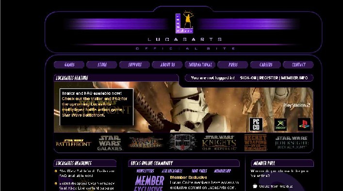
www.lucasarts.com First Impression: The first impressions I got from this site was that it is set up in a bit more complex manner, with more to do on the opening page then the two sites before it. Yet it is not until one actually starts to explore the connecting page that some are less complex to use. The graphics were up to the standards that are to be expected if not more, by a company of such a high reputation. The graphics used on the page are of the highest quality and are very helpful when trying to see what the game play for each game would be like on the different systems on the market. Navigation: The navigation on the LucasArts page takes some getting use to. There are a lot of the links, which are gifs or other such items, which add a bit of confusion when looking around. Otherwise the site is set up with many tool bars and drop down menus which help in the navigation and search of the site. Problems: The only problems seen on the site was the gifs as links to other site, which, as stated above, make it a bit confusing at first to use those links. Another problem viewed on the site was that sometime the page being viewed was a bit crowded, which can confuse the viewer at times, if they don't keep their eye on what they are viewing. E-commerce: The ordering method on the site was very easy to use and can be picked up by any user. The site like any other has a very secure way of ordering products which makes sure the card holder information is matching up with the shipping and other information given by the user. If any information is entered incorrectly or has any discrepancies, the order may not be completed. |
|
 4 put
of 5 4 put
of 5
|
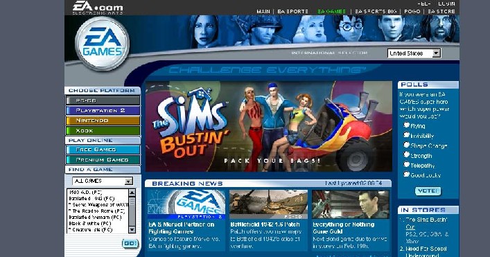
www.eagames.com First Impression: My first impression of this site was that it was less professional looking as the other ones. The lighter colouring in compared to the other sites made it look more like a site for kids then a computer gaming site. However the graphics on the site where just as good as the previous sites visited. At first the site hits you with a lot of information on the first page, which takes a few minutes to get use to. Navigation: The layout of the page is very simple and can be used by any user. There is a list of the types of platforms for each game, which stays with you throughout the whole viewing process. This is convenient in case the user wishes to switch platforms for the games. However the abundant information given all at once can make the start of the viewing session a bit confusing, while the user gets use to it all. Problems: The main problem viewed with this site was the amount of information thrown at the user all at once. This becomes a bit much when the user first loads up each page and has to get use to the page for the first few minutes of viewing. E-commerce: The buying process on the site is one of the most secure that I have seen. Before the user can even place and order, they first have to log on to the site as already registered user or activate a new account. This is the same buying process as the users of the Westwood site have to go through, since they are both run and operated by EA Games. |
 3 out of 5 3 out of 5
|
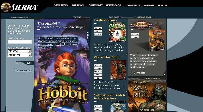
www.sierra.com First Impression: My first impression of this site was that it was a bit less organized then the first four sites visited. The graphics on the opening page did not seem to be of a very high quality one would come to expect from a computer gaming site. The opening page did not have as much on it, or in such an intense fashion as the other sites had. Navigation: The navigation of this site was very simple and easy to get a hang of. There were simple to use drop down menus and a tool bar at the top of the page for easy access to information on the games provided by Sierra. On the good side the site offered a listing of games by genera’s, which none of the other sites offered. Problems: The only major problems with the site were that it was a bit simple and child like for such a company. Also the ordering system was not operated by Sierra itself, but another online ordering system. E-commerce: The ordering system used by Sierra is not operated by the company but by another company altogether. In such a case some users might be discouraged to place any orders if they have no idea about the site they are ordering from. This is a huge security concern for many people. Sierra will probably get more on line purchasing if they run and operated the whole process themselves. |