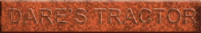
This is not really finished art but rather a concept sketch of a logo for
Dare's Tractor. The background is a bit too flakey looking I think. I was trying to make the letters
looked embossed, as if stamped into the metal of an old tractor. I think it does that, basically but needs
some sort of contextual element ...mabey some horizontal lines and some rounded shapes.
It's a start anyway.
Any thoughts appreciated .
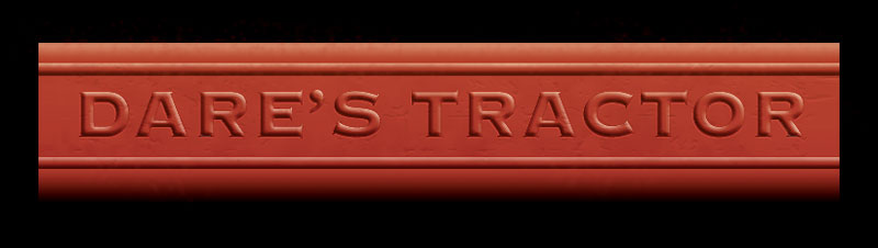
Ok...so I've developed the idea a bit more and tried making it look a bit more tractor like.
This version is a lot more legible.
I can see this used as a header banner on a website. The color is a bit pinkish on my monitor. probably needs to be a bit more orange.
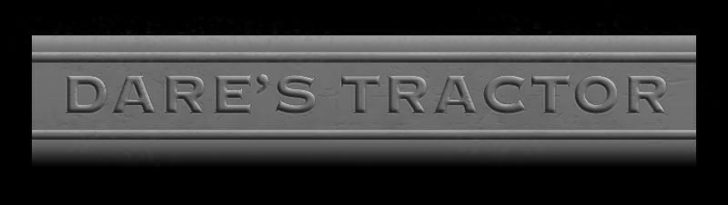
And here it is in Black & White. It's always a good idea to see how things might look printed in one color such as
a newspaper advertisement. I almost like it better this way and it reminds me of an old movie more.
Here I made the color more orange like an old CASE tractor, spattered it with some flecks of dirt and
added a slight lighting effect. Hope we actually use an orange tractor.
I'd be satisfied with this used 'as is' on a promotional web page.
The typeface used is "Copperplate" which works well with video because of the bold
even stroke of the letter. So we could also use the same typeface on the opening titles.
The file size is 148 kb which is a little large but it could be compressed to about 100kb. Either way
it should load plenty fast enough for web use.
