Season One | This was MP's first logo. It reflected how the story was just beginning, and how single events were having a ripple effect in each character's life. The logo was quite durable, and can still be found on neighboring sites. |
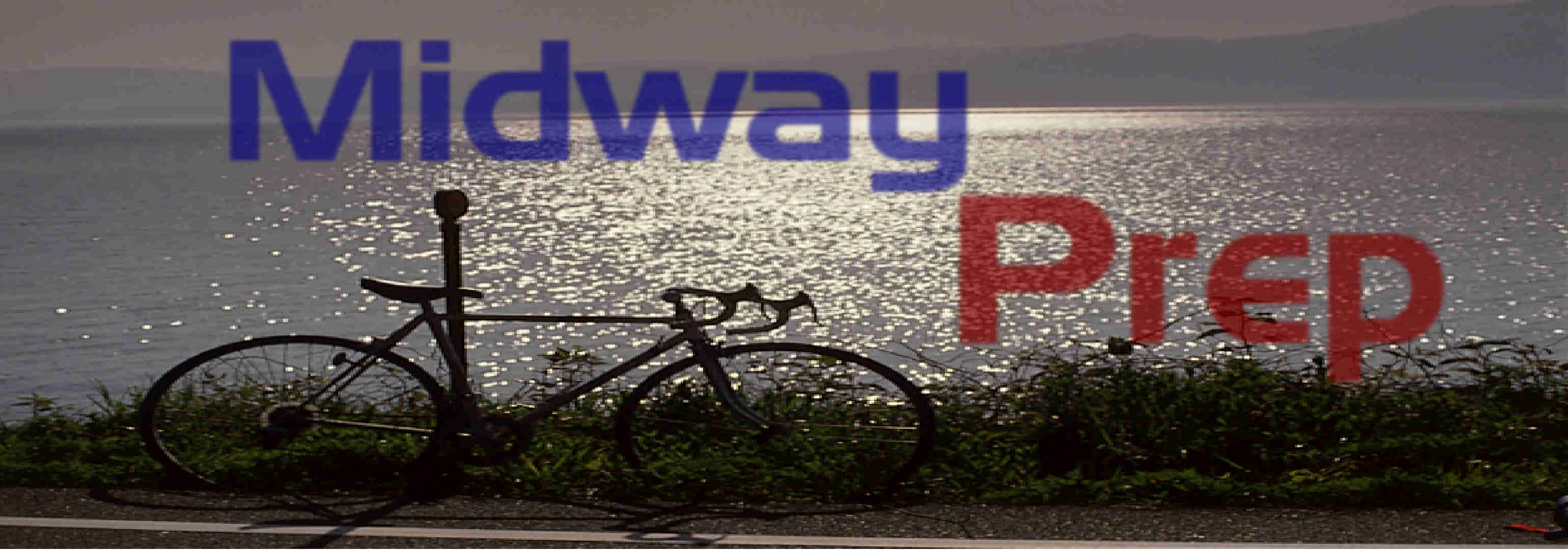 Season One | The second logo of season one was still a watery one, but this time the view was wider, with the entrance of a bicycle. Of course, these kids are still teens, so the lone bicycle was quite appropriate. |
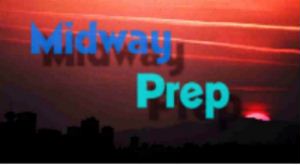 Season One (Episodes 45-50) | The third and final logo of the first season was just a filler until the next logo came along. It was made because of the new design and the "new look" of Midway Prep. |
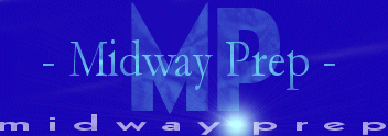 Season Two | The new logo for the second season was a drastic change to the first three. A large, textured MP loomed in the background while a thin yet professional "Midway Prep" was in the foreground. The small, spaced Midway Prep on the bottom was added for effect, especially with the bright sunburst in-between the Midway and the Prep. |