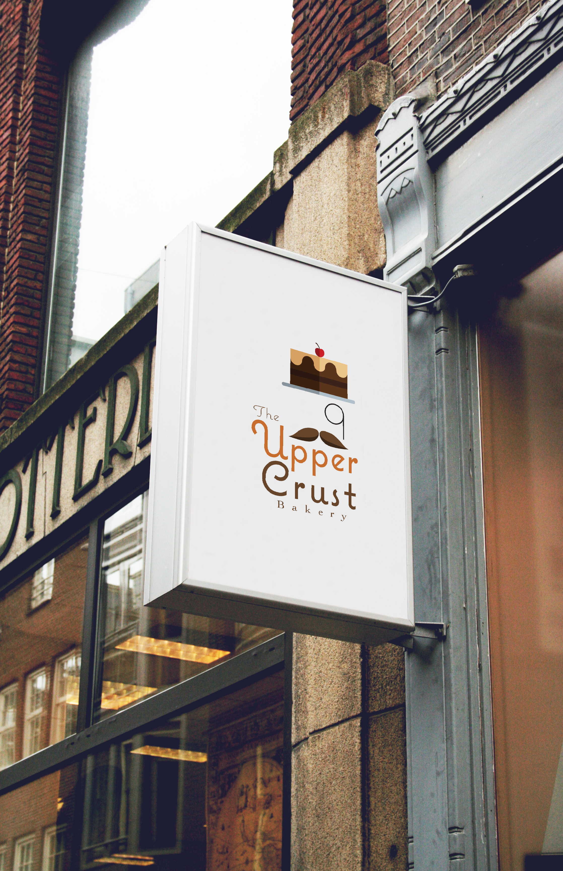
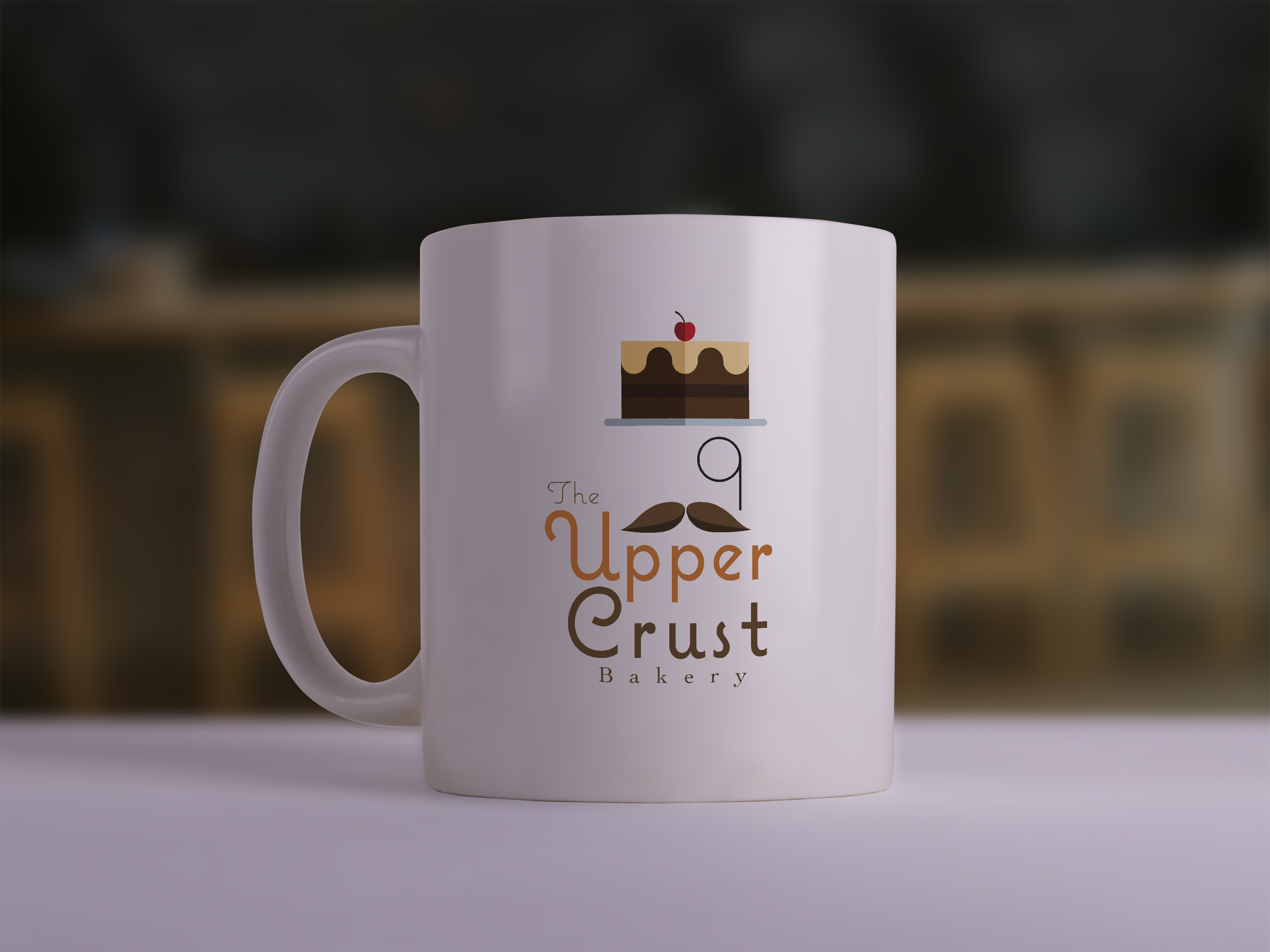
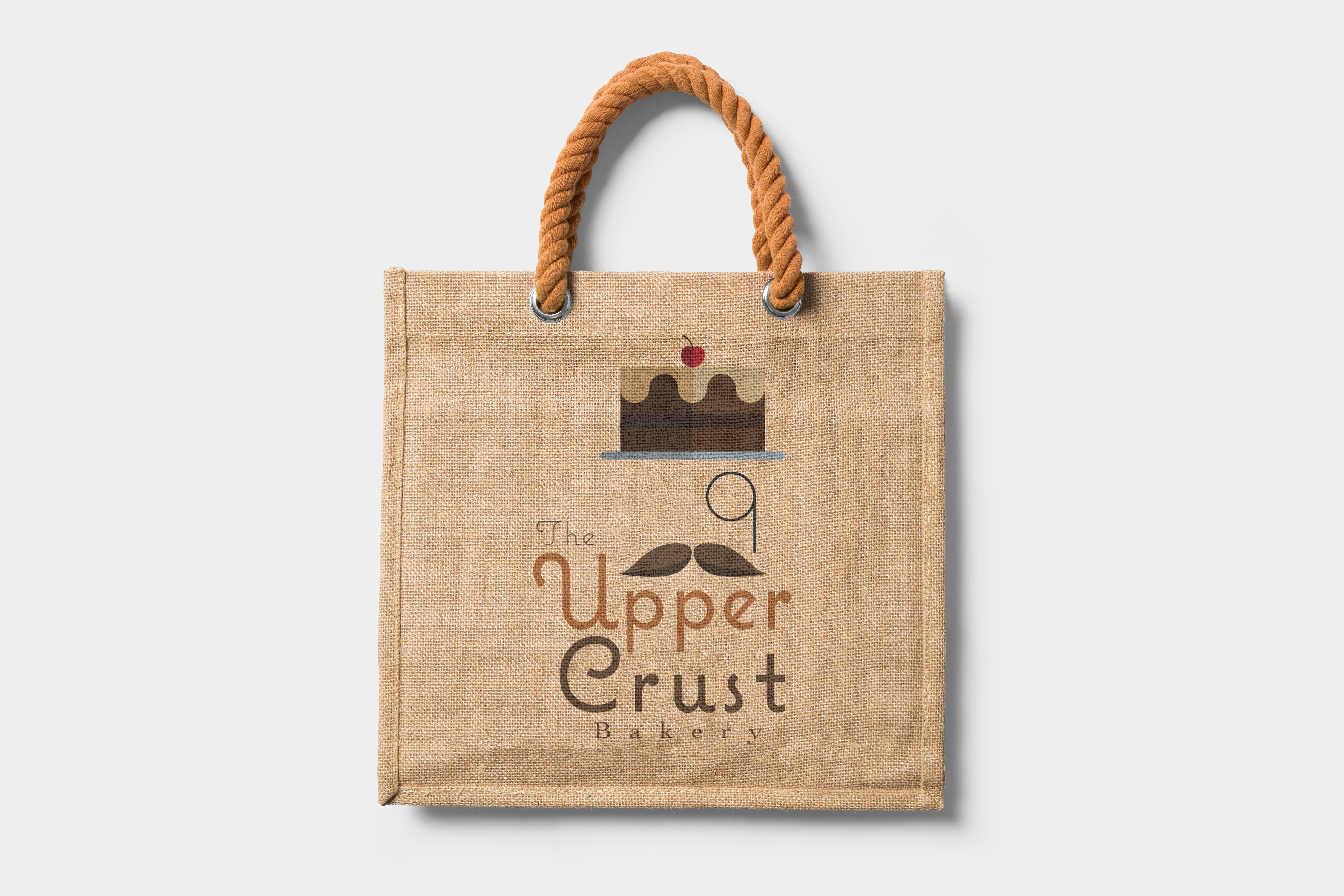
Designed for a university project, this logo was created for a fictional bakery, named The Upper Crust, who required a logo redesign. The design brief required that the logo include text of the business name as well as a symbol.
The image I created for the logo was designed as a play on the etymology of the phrase “Upper Crust” which originally referred to the earths surface or “crust” or someone’s head/hat. The earth's surface and head/hat meanings connect “upper crust” with “top” and our present application which means a member of high society. I replaced the hat with a cake and suggested with the rest of the image a member of high society, maybe from the 18 or 19 hundreds.