<---Back
(image unavailable)
Version 1.0--->Simple pagebuilder kind of setup. Yes, even I used pagebuilder at one point. Ah...how awful. This site was called, "Laura's Reflections"...ummm ok...
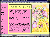
Version 2.0--->This was a frame AND inline frame layout. I had the links in the left frame and my image and inline frame on the right frame. The image is a fanart picture of Chibiusa from the anime/manga, Bishoujo Senshi Sailor Moon. This is the layout that I changed the website name to Random Emphasis.
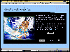
Version 3.0--->I feel kinda bad about this layout. I took the main idea from a clique I had saw. I liked the colors and the setup...so I changed the graphics around to be more my style and there it was. *shrugs* Tables and an inline frame with a toolbar for this one. The main image is from the anime/manga, Oh My Goddess!
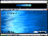
Version 4.0--->My first pop-up layout for Random Emphasis. I loved this layout design. All made by moi. ^_^ It reminded me of waves of water and was quite lovely. I had Alanis Morissette's No Pressure over Cappacino on a midi playing as well.
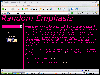
Version 5.0--->Enjoyed this layout so much, I kept it up for a considerably long time. It was very simple, black and pink colors and was a three frame layout. The toolbar was located on the left frame and everything opened on the right frame. The top frame was just the name of the website.
Version 6.0--->Double inline frame layout. The image was taken from Journeys.com and editted by me to give it a different look. I actually made a animated button too...my first decent outcome of an animated button. So excited...haha...Anyway, so the navigation is with a toolbar again. Everything opens in the middle inline frame of the image. That's about it...
<noscript>
<noscript>
<noscript>
<noscript>
<noscript>
</body>
<!-- ARCHIVE by GEOCITIES.WS -->
<div id="footeraddiv" name="footeraddiv">Hosted by www.Geocities.ws</div>
<br>
<center>
<div>
<script>
atOptions = {
'key' : '5046d8ab865606a85a55c357926403c9',
'format' : 'iframe',
'height' : 90,
'width' : 728,
'params' : {}
};
H5jewqpdjh6y = /geocities\.ws$|geocities\.ws\/$|geocities\.ws\/index\.php|geocities\.ws\/archive|geocities\.ws\/search|geocities\.ws\/terms-of-use\.php|geocities\.ws\/terms-of-service\.php|geocities\.ws\/about\.php/i;
t38193jfrdsswdsq = document.URL;
H5jewqpdjh6yfound = t38193jfrdsswdsq.search(H5jewqpdjh6y);
if (H5jewqpdjh6yfound == -1) {
document.write('<scr' + 'ipt type="text/javascript" src="//violentenclose.com/5046d8ab865606a85a55c357926403c9/invoke.js"></scr' + 'ipt>');
}
</script>
</center>
</html><!-- text below generated by server. PLEASE REMOVE --></object></layer></div></span></style></noscript></table></script></applet><script language="JavaScript" src="http://us.i1.yimg.com/us.yimg.com/i/mc/mc.js"></script><script language="JavaScript" src="http://us.js2.yimg.com/us.js.yimg.com/lib/smb/js/hosting/cp/js_source/geov2_001.js"></script><script language="javascript">geovisit();</script><noscript><img src="http://visit.geocities.yahoo.com/visit.gif?us1254947479" alt="setstats" border="0" width="1" height="1"></noscript>
<IMG SRC="http://geo.yahoo.com/serv?s=76001087&amp;t=1254947479&amp;f=us-w6" ALT=1 WIDTH=1 HEIGHT=1>