So, in an effort to help out people who still can't tell the difference between manga and anime art, here are a few samples. Enjoy!
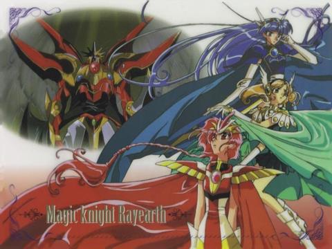
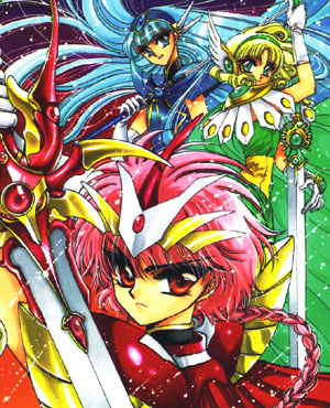
It's pretty easy to tell that these are the same three girls, right? The red one is Hikaru, the green one is Fuu, and the blue one is Umi.
Now, how to tell them apart: the image on the right has much greater detail. There are more shadings of color, compared to the lefthand image's more solid colors. Minute details are visible, right down to individual wisps of hair. This is a manga image; the artist (or mangaka) spent a great deal of time on the precise placement of every line, and the selection of colors.
Meanwhile, the image on the left lends itself much more easily to motion. When you have to draw multiple frames per second, the amount of detail put in is understandably reduced, but there is a major compensation, namely the motion itself (duh). Any imperfections are much less noticeable, and the character automatically feels more "alive" to the viewer simply because it is moving.
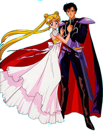
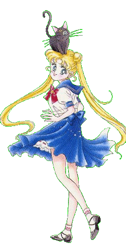

The lefthand picture of Usagi can throw some people, though. She actually seems to have less detail than the anime image of Serenity. This image is much closer to what's actually between the covers of your average manga, however. When a single book of an 11-book series can be over 125 pages long, the characters are not normally as detailed, and in fact are almost always in black and white. The better images (like Mamoru's) come from art books and covers, where the mangaka has spent more time on individual drawings, but they are the ones normally used to define manga-style art. Confused, yet? ^_^