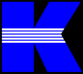
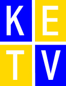
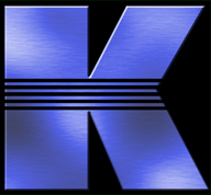
| In June 1997, the company of KET had been founded. The only problem was that KET didn't have a respectful logo to symbolize the company. That was until Kris Starring sketched the idea for the logo (a blue "K" with five horizonal lines through the center.) and gave KET it's own image. It wasn't until July 1997, on KET's first show, that Jamie Settle brought the logo to life by animating the "Blue K." (You can see a video of this early animation here.) In 2000, KET entered the new millenium with a modern design, nicknamed "The KETV Boxes." Many found this design too plain, so in 2002, the logo was unceremoniously dumped. In mid-2002, KET's famous "Blue K" got a revamp, and resurfaced everywhere. Some have asked what the logo is supposed to represent, and the answer to that question is simple. The blue and black colors represent the sky, as "the sky is the limit." The five lines represent the company's five divisions: News, Sports, Entertainment, Information, and Operations. |