GEOG5222 Lesson 7Introduction to Raster GIS AnalysisJohn Taber |
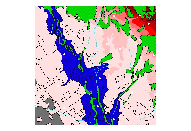 Figure 1: This is a manipulation of the initial data available
for the task at hand, finding suitable areas vineyards in a part of Napa
County, California. Elevation is shown in the background, with the
overlaying colors showing areas known to be unsuitable: gray is urban development,
green forest, and blue floodplain. In addition, light blue lines indicate
streams, and white shows stations for which climate data is available.
Figure 1: This is a manipulation of the initial data available
for the task at hand, finding suitable areas vineyards in a part of Napa
County, California. Elevation is shown in the background, with the
overlaying colors showing areas known to be unsuitable: gray is urban development,
green forest, and blue floodplain. In addition, light blue lines indicate
streams, and white shows stations for which climate data is available.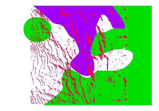 Figure 2: This shows three reclassified grids. Red
represents unacceptable slope aspect (toward north and east); green, an average
maximum wind speed greater than twenty-five miles per hour; and blue, average
minimum temperature less than thirty-five degrees Fahrenheit.
Figure 2: This shows three reclassified grids. Red
represents unacceptable slope aspect (toward north and east); green, an average
maximum wind speed greater than twenty-five miles per hour; and blue, average
minimum temperature less than thirty-five degrees Fahrenheit.