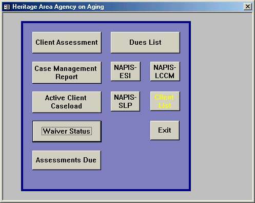
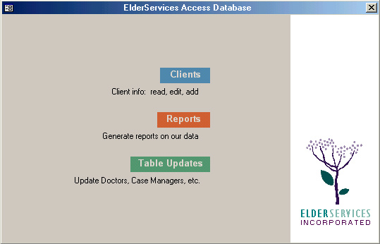
| Old vs. New highlights | |
| Main menu |
|
|
||
| OLD | NEW | ||
| A random parking lot for windows and reports. Button size and location suggest order, but are actually meaningless. | Tip of the iceberg. Below lies a well-thought-out architecture of elements. User goes to specific area for task in mind. |
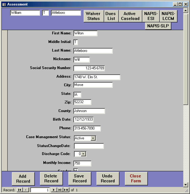
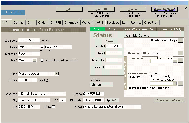
| Client Tracking |
 |
 |
||
| OLD | NEW | ||
| Curiously, fields are stacked in a single column (note scrollbar!). Subforms were being added to handle what could not fit here. | Tabular design allows all kinds of data to be included here. This became the heart of the database. |
| Monthly Stats |
| OLD |  |
 |
|||
 |
|||||
| Type in county, then name of month desired. AND dates for first and last of that month. Press some buttons in a mysterious sequence. Do some math. More buttons. Subform opens. | Check data on subform; make adjustments. | Report generated. Better get it right, as each month's new data writes over previous month's. |
|||
| Wait - There's more! Annual rollover instructions: | |||||
 |
 |
 |
|||
| (Done every fiscal new year for OLD version) | |||||
| NEW |  |
 |
|||
 |
|||||
| Select county and month desired. Click a button to open subform. | Check data on subform; make adjustments. Entire fiscal year's data is preserved, and displayed at once. Selected month is hilighted. | Report generated. No rollover procedure to deal with. | |||
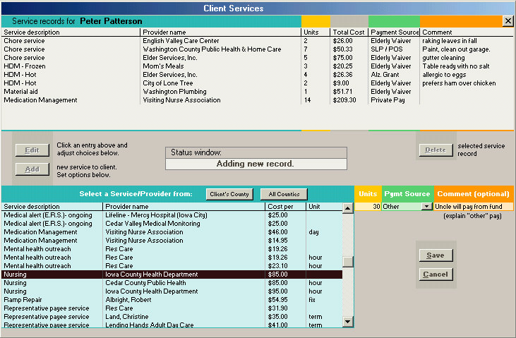
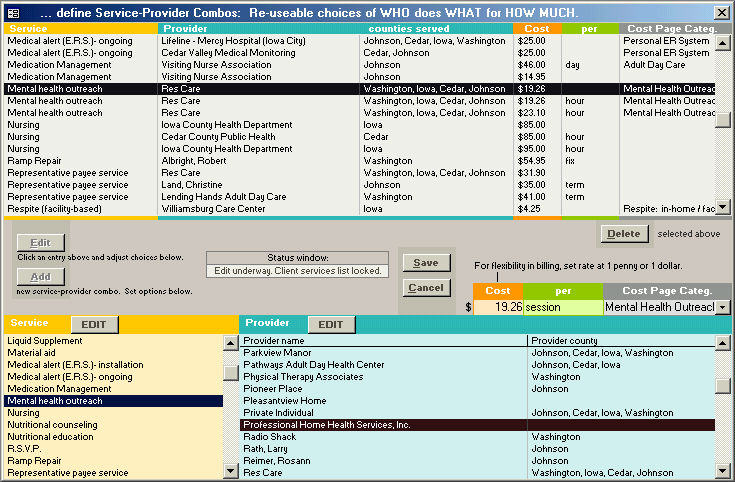
| Tracking of client services |
| ALL NEW | |||
 |
 |
||
| Each service a client receives is added as a new record, in à-la-carte style. | A similar interface builds a library of commonly used
service-provider combinations.
|
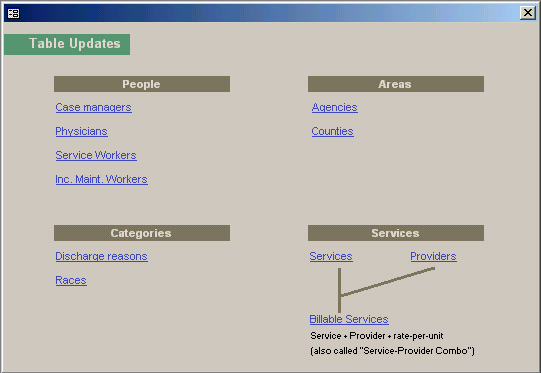
| Updating non-client data |
| ALL NEW | |||
 |
 |
||
| A sub-menu grants edit power over all peripheral data. Formerly done through table-tampering. Interfaces now protect data. | A sample edit window: this one for Physicians' data. |