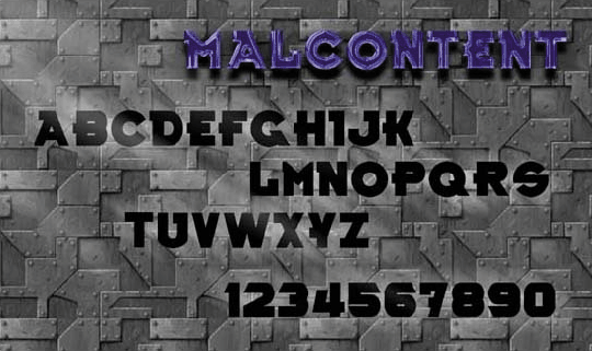
FONT DESIGN
Previous image

'Interlace Font'
'Malcontent Font'

(picture 3 of  3)
Next image
'Aeris Font'

 
The typeface presented below is referred to as the 'Malcontent' font. It is a serif design. It has clear, thick strokes and is easy to read, making it ideal as a form of display type. It has a hard, industrial feel to it, and as such, is highlighted with a metallic, armor plate-style backdrop.

 
(Chess)
© Harvey Neil Johnston. All rights reserved.


'Interlace Font'

'Aeris Font'

return to portfolio


This work is copyrighted. Please keep in mind that none of the images or ideas from the online portfolio are free to copy or use for anything but personal online viewing, without the written permission of the Harvey Neil Johnston. Please, read the legal information first.
Hosted by www.Geocities.ws

1