| |
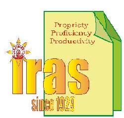
The word ‘iras’ stand for Indian Railway Accounts Service, one of the Central Group ‘A’ civil
services in Indian Railways. The orange colour of the word ‘IRAS’ denotes warmth, vigour
and courage. The small letters (as against large capital letters) denote humbleness. The words
‘since 1929’ indicate that the service was created in 1929 and has completed 75 years of its
existence.
The Indian Railways logo on top of the word ‘i’ denotes that the service is very much a part of
Indian Railways and supports the organization wholeheartedly in its progress towards greater
laurels with prudent financial advice. The sun’s rays around the IR logo depict radiance and
sparkle for the organization as a result of this support.
The two pages or pieces of paper indicated in the logo represent the accounting work which is an
essential and important part of the work of the officers who are members of the service. The pale
yellow colour of the paper in the foreground denotes the wisdom and intellect with which the
officers carry out their work. The green colour of the background paper denotes the stability,
endurance and environment-friendly nature of the service.
Finally, the motto of the service is enshrined in the three keywords, which form a part of the logo
– propriety, proficiency and productivity. Through propriety of expenditure and proficiency in
their work, the service aims at continuously increasing productivity for the parent organization
i.e. the Indian Railways.
(The logo has been designed by Ms Aparna Garg, IRAS(1987) presently working as Member-
Secretary, RRB, Bangalore and has been selected from several entries received from IRAS
officers and their families as a part of a design competition).
|

 THE CONCEPT OF THE LOGO