| Me & My HTML | |||||||||||||||||||||||||||
 |
|||||||||||||||||||||||||||
| Lesson 8 | |||||||||||||||||||||||||||
 |
|||||||||||||||||||||||||||
| Lesson 8a Picture | |||||||||||||||||||||||||||
| Lesson 8 for Classreport.org Administrators | |||||||||||||||||||||||||||
| Home | |||||||||||||||||||||||||||
 |
|||||||||||||||||||||||||||
| Lesson 8b Picture | |||||||||||||||||||||||||||
| Email: | |||||||||||||||||||||||||||
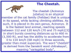
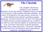
| Lesson 8 The two displays above look very similar but by looking closely you will see that the titles are different. First, to encompass our work, I would like to get a box. One that will work is the one from Lesson 1. Remove everything between the first occurrence of the tag <td> and the last </td>. We should have just a red box that has a thin white line in the middle. I am making mine blue as I am tired of red boxes. I want to keep the width="440" as that is a limit set for work posted on the classreport.org website. For this lesson we will need a graphic to use. I found one that will work very well. <a href="http://tinypic.com" target="_blank"><img src="http://i36.tinypic.com/icobjk.jpg" border="0" alt="Image and video hosting by TinyPic"></a> The reason for this graphic is that it must be small enough to fit in only part of the box. We should add a couple of Comment lines between the <td> and the last </td> tags. Something like <!-- Start of the Data section --> and <!-- End of the Data section --> with some working space between them. Save the file as Lesson8. Add the graphic in the center of the data area leaving some workspace above and below for more entries. We first will work with plain text. We will define the test font as: <font face="verdana" size="4" color="blue"><strong> The Cheetah. </strong></font> We will work with the text from a search that I made on Cheetah . This is what I call gibberish if I ask you to explain the reason for the link or if you are trying to post some instructions. I will say, "put in your gibberish text." We will use: {The cheetah (Acinonyx jubatus) is an atypical member of the cat family (Felidae) that is unique in its speed, while lacking climbing abilities. As such, it is placed in its own genus, Acinonyx. It is the fastest land animal, reaching speeds between 112 and 120 km/h (70 and 75 mph)[3] in short bursts covering distances up to 460 m (1,500 ft), and has the ability to accelerate from 0 to 110 km/h (68 mph) in three seconds, greater than most supercars. The word "cheetah" is derived from the Sanskrit word chitrakaya?, meaning "variegated body". } as the gibberish. The font should be set to Size="2" and no <strong> tag. Preview what you have and the information is there but it looks a bit messy. As we did in lesson 6, let up format the text around the graphic and space the graphic with a 10 pixel space around it. Remember we used the attribute: align="left" vspace="25" hspace="25" in lesson 6 but we want 10. This does make it look better but there still is a mess. I would think that the title and gibberish should be separated. We could do this with one or two line breaks tags. Previewing again shows that there may be a need for a bit more fine-tuning with this particular display so using the centering tag on all of the text, do not include the graphic, will really clean it up. If you center it, be sure to close the center tag at the end of the text. You can change the color of the text in the attributes of the font tag. We now have a very good-looking display. What other ways could we have accomplished this? The top of the text is really a header. There is a header set of tags, <h1> through <h6> and the closing tags of each. This can be used in place of the <font ..> tag. Let us work backwards through the header tags. Replace the font tag with <h6> and the closing font tag for the header to <h6>. The header has lost its color so there must be needing the <font color="blue"> to get it back to blue and then we need to close the font tag. Now the header is blue but very small. We still do not have the look that we had with the <strong> and <Font..> tags. There is something missing. Maybe there is too much there! Remove the line breaks. Removing the two line breaks corrected most of it. Try each header selection and see what header tag looks best. Did you notice that any header close would keep the gibberish at its normal appearance? Remove the </h6> or what ever you have it set to and preview. Then put it back. It should match the header number you opened with for ease of reading. I like the display with this graphic of <h2> the best. If the graphic were taller, <h1> may have looked better. You can see that the header tag gives a space under it that we had to use the line break to do the same as the <font..><strong> usage. We now have two ways to approach titled text. Save Lesson 8. |