| Me & My HTML | |||||||||||||||||||||||||
 |
|||||||||||||||||||||||||
| Lesson 6 | |||||||||||||||||||||||||
 |
|||||||||||||||||||||||||
| Lesson 6 Picture | |||||||||||||||||||||||||
| Home | |||||||||||||||||||||||||
| Lesson 6 for Classreport.org Administratiors | |||||||||||||||||||||||||
| Email: | |||||||||||||||||||||||||
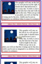
| Lesson 6. This lesson will reuse part of Lesson 2. Open the old Lesson 2 and do a Save As to Lesson 6. We will leave the Horizontal Marquee and not change it in any way. The Vertical Marquee is our area to work in and we will start by removing all of the Marquee data. We will remove from and including the center tag to the closing center tag but leave the table definition tag and table closing. We should have: <center> <table ...> <tr> <td> and the closing of these tags. There should be some space between the <td> and the </td> for our new entries. Let us also make the red box larger by changing the width from 270 to 418. This will better suit our lesson. We are going to use one of your other graphics. It is: <a href="http://www.coolholidaygraphics.com/halloween/" target="_top"> <img src="http://www.coolholidaygraphics.com/halloween/animations/animatedgif.gif" border="0" alt="Halloween"></a> And we will use some gibberish: This graphic will stay on the left as we will put text on the right. It should show that Halloween is not a crazy day. It really is just a day the kids have fun and walk at night in the rain. When you go out as an adult, you will see that the evening can be fun also. Adults can be just as imaginative as children when it comes to costumes. 2. First place the graphic in the blank area. Preview it and return to the Editor. 3. Now copy and paste the gibberish under the graphic, Preview it and return to the Editor. 4. What you see is now really good looking . There is a lot of white area that is not being used. You could center the graphic but that just cuts the white area into 2 smaller white areas. I would like to make the gibberish into a paragraph so I can work with it as a defined set of text. the Paragraph tag is <p> </p>. Enter these with the gibberish between them. Now that makes it look even worse but the gibberish is all together as a block of text. There are some attributes that can be added to the Graphic that will isolate it from the world also. It will free up all of the area to its right for other uses. Granted you can put another graphic there very easily. Preview it and return to the Editor. 5. First let us force it to stay on the left with an attribute align="left". You can put anywhere in the graphic line but we will put it at the end in this lesson. We are modifying the <img ...> tag as the <a ..> tag is only telling us what we want to be displayed and the <img ..> tag tells us how we want it to look. Preview it and return to the Editor. 6. Now that is making better use of the space where we want the graphic and text. The graphic looks a bit squished up against the text. I think that it could stand some cleaning up. To do this we will create an area around the graphic that must be kept clear. The attributes are vspace and hspace. they are then followed by a number which indicates the number of pixels to keep free. Let us use 25 for now. Any number could be used up to around 300 as the graphic does take some space. The best way to see this is to copy all of the section and paste the copy below the one we have been working on. Now add the attributes, vspace="25" and hspace="25" just after the attribute we added in step 6. Do it to the freshly pasted section. Preview it and return to the Editor. 7. This looks better gut there still is something wrong. The first line of text is above the top of the graphic. Place a line break in the gibberish line just after the <p> tag. Now the display looks cleaner. Preview it and return to the Editor. 8. The final step is to show that these boxes are not necessary. We could remove them but let us try something else. The best way to see this is to copy all of the second section and paste the copy below the one we have been working on. We now have 3 occurrences of the display and the one we will work on is the last. Most people forget that white is a color. Let us replace the 2 attributes for the interior red boxes with white so it reads: bordercolor="white" Save the file. Preview it and return to the Editor. You can do the same to the last blue bordercolor attribute. The boxes are great to work in but the final product can look better without some of them. The bgcolor of the horizontal marquee can be changed as you see fit. Just remember that white is a color. You can have a black background and white font. NOTE: Back in Lesson 4., the display became distorted by the adding of the first slideshow. When I say distorted, I mean that we no longer had the display width at 440 pixels. This is caused by the width of the banner at the top. It will work on the website but these wide banners can change the complete Home Page if used. If you get a Home page that does not have the Login as it should or the third column is missing, look for a banner that is too wide first. They are the most probable cause of this type of trouble. I would put them in one of these box lessons like lesson 3. Just replace the top Hello! with the graphic. Compare the box width to the box below. You can see if it is too wide if there is a space on either end of the second box. |