 image.object
 | image.object |
Home |
My Final Logo
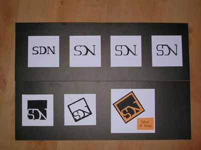
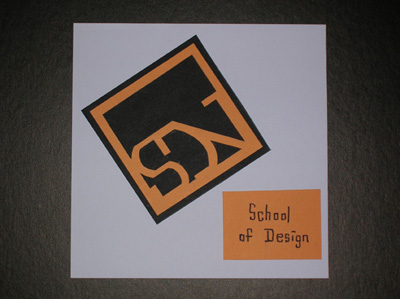
DescriptionThis is a logo design I created for the NYP's School of Design. This is a logo design I created for the NYP's School of Design, using Paul Rand's process of corporate logo designing which I was especially fond of. I started off, like what Rand did, by choosing a typeface for my logo. Wanting to differ NYP's from other Polytechnics, I chose to use the Font of the NYP logo itself. It is a logo known to many people, thus giving my logo an identity of where it belongs. The initials, SDN, are first figured out as individuals then merged into 1 shape, just like how the NYP logo is created. Then by using Paul Rand's 'problem-solving' method, I continues to modify the logo bit by bit to fix it. So instead of creating a bunch of variations, the end result will be only one, but a perfect one. Still with Rand's design in mind, I kept my logo as simple as possible. Not a single line nor shape is unnecessary. The artwork is done in black and white only, so to ensure it's simplicity. After finalizing the lettertype, I moved on to enhance the logo. Like what Rand did, a basic square (sometimes a circle) is given to the logo. The lettertype sort of integrates into the square, resulting in an abstract shape, so the letters doesn't look slapped onto it. Adjustment made to ensure legibility. The square is tilted at a degree, whereby Rand does it to create an interesting visual by breaking the grid format. A color is then assigned to the logo, in this case Orange. Orange is the color of SDN, and also it portrays the energy, enthusiasm and innovative of the school. Also widely accepted by teenagers. The final logo is one that is simple, visually interesting, original, and brings about the mood of SDN. I presented my process of logo design by mounting the different stages of changes. The form changes each stage, like morphing from a raw material to it's final product.
|
|
 image.object image.object |
|
 bio.info bio.info |
|
 museum.links museum.links |
|
| HTML / CSS | |
| Site Design by He Shu Guo | |