
The "Watercolor" Effect
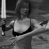
The first thing to do towards the watercolor effect we're looking at here is to make whatever detail adjustments you think necessary to your render. If you like, you can lighten (or darken) your render using the Levels command, or the Curves command, if you feel pretty ballsy - sorry, but Curves still scare me. Went around one too fast, and totaled a brand new render...
Next thing to do - and do this EVERY TIME - is DUPLICATE YOUR MAIN WORKING LAYER. This is nearly as important in Photoshop and its kinsmen as the "Save early, save often" rule of every computer program. This way, if you just can't get what you want, but your image is too jacked to recover, you only have to delete layers. Easy as pie.
Now, there are two approaches with the "watercolor effect." (Three, actually, but using the watercolor filter doesn't count - it looks like shit.) The differences are minor, really... But to go the way I did with the image we're looking at, your first step (after duplicating your working layer, of course,)
Is to desaturate your image. This can be done in one of several ways. Depending on your program, you may have a single button marked desaturate somewhere in the menu. You might use the Hue/Saturation sliders. Or, for the really adventurous, you might try copying out the information from a single channel (Red, Green or Blue) to create a grayscale image. However you do it, what you need is an RGB image composed only of shades of grey. The image to left was created by using Photoshop's Desaturate command. (Note - if you use the information from a channel, your best bet is to use green or red when working with figures - they tend to produce better contrast in areas of skin.)
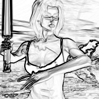
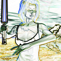
The next step, and this is the vital one... is to use some command (I used Find Edges in Photoshop, under Filters>Stylize) that finds the edges of your picture. Every program I've used has a command that does this. The image on the left was created from the grayscale image above; the one on the right was created without desaturation. It's only there for curiosity's sake, really - but it should be pointed out that the behavior of the layer on the left would be very different from the behavior of the one on the right. Try out that variation - you may find you prefer it. (I normally do)
Now, since you should still have two layers, one with the outline we just created, and the original layer - you do still have the original, right? No, that's okay, go under file and hit Revert. We'll wait.
Well, while we wait for "Mr. I Didn't Think He Was SERIOUS About Needing Multiple Levels," the rest of us can move on. This is the second part of the "Big Secret," and it's damn easy.
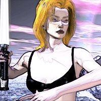
You know that palette off to the side that says something about Layers? Its got little eyes and check boxes and whatever. Make sure all eyes are on. This means that all layers are visible. Now, somewhere in there, each layer has a control for its Blend Mode. These have names like "Multiply," and "Saturation," and "Color Dodge." Play with the outline's blend mode, it has some interesting effects - oh, I see you found my secret. If you hit Overlay on the Outline's Blend mode, you probably have something that looks like the image to the left. That's all there is to it.
The other secret is that I played with the Outline layer's visibility. It's actually only around 20% to 25% visible in the actual picture.
Another interesting effect can be created by setting the Outline's Blend mode to "Luminosity," but it's results are a little more overpowering, and should be used only for special effects, or as the focus of a piece.
Return to the Tutorial Menu.