 |
|
|
|
|
|
|
|
|
|
|
|
|
|
|
|
|
|
|
|
|
|
|
|
|
|
|
|
|
|
|
|
|
|
|
|
|
|
|
|
|
|
|
|
|
|
 |
|
 |
|
|
|
|
 |
|
 |
|
|
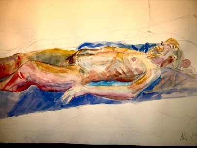
My art portfolio is the most interesting thing i have ever made. It contains as many as forty pictures, mostly A1, and uses many styles and techniques starting with basic drawing and painting and ending in strange multimedia. The quality of this work is exceptional compared to that i had created earlier in my school life. It was quite a change for me to go into the portfolio building class from simple higher art. I was expected to produce one piece of A1 work per week. This was really hard for me to imagine since my biggest picture in higher had only been A4. So suddenly i was working on huge pieces of paper and i have found that this scale of work really suits me. I hope to add a gallery of my portfolio work here so that people can see the kind of work that i produced in order to get into art college. On the right is the only picture i have from my portfolio on the computer. This picture was kept |
|
|
|
|
|
|
|
|
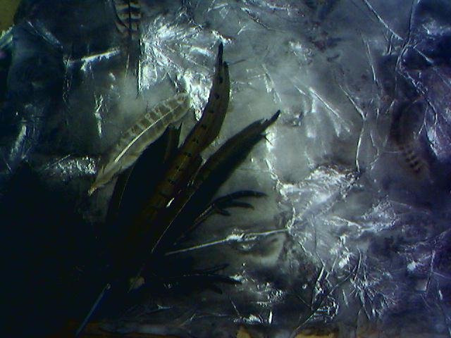
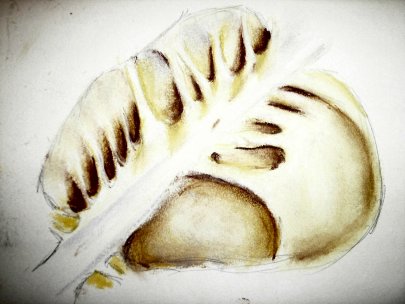
out of the portfolio that was sent to the Art college for viewing as my teachers and i agreed that it was not an incredibly strong piece and i could put a much more impressive work in it's place. This picture was made by trapping dried leaves between two sheets of teabag style paper and then dying the paper with the leaves inside with a special mixture of ink water paint and rubbing silver. The final touch was the feathers and Pheasants feet which were later put in using press printing. |
|
|
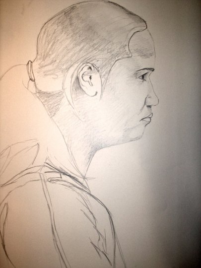 |
The follwing pictures are taken from my 1st semester at Dundee art college and are the most recent examples of my work i have. The picture on the left is of my good friend Ailsa from my class who i'm sorry to say doesn't feature in my friends page due to the fact that i don't have any pictures of her apart from this one. This picture was done during the portraiture block and we did these pictures in groups of 4 all facing a different person forming a circle so that everyone ended up with a profile view drawing. The picture was done in 30 minutes so i havent gone much further than defining the most basic detail and line but i think there is a fair amount of Ailsa in this picture. |
|
|
|
|
This was one of a series of studies i made on a piece of bird skelleton that was in the studio. This picture was done using chalk pastels and is acctually a lot more colourful than it appears as i'm afraid the camera made the picture much lighter and whiter than it acctually is. I am however quite pleased with the way this particular picture turned out. I also drew it from many angles and in media such as ink and charcoal. I think that this piece is much more interesting due to the fact that it reflects the colour of the acctuall artifact itself. |
 |
|
|
|
|
|
 |
|
 |
|
|
|
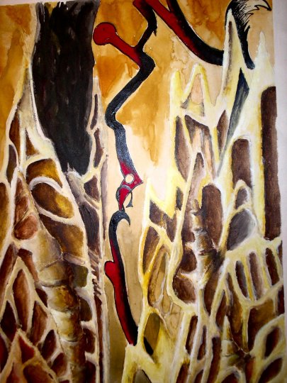
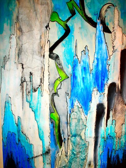
These two paintings are a pair, kind of like a diptych or however you spell it. They were done in my favourite way which is to take shapes and forms from work i've done before and portray it as a landscape so i end up with these otherworldly scenes. The one on the left drew its imagery from old driftwood that had somehow gained a blue discolouration around where the bark had been and in this picture you can get a sense of the grain of the wood in the way the mountains seem to overlap. On the right is the same scene only this time rendered in bone. I based the colours and shapes on the picture of the bird skeleton shown above and took elements from the origional work and changed them to leave this warm looking, smooth, bone landscape. |
|
|
|
|
|
|
 |
|
|
This piece you can see here was a colour based project in which i worked from a book of landscape photographs i found in the library. I worked from pictures that had a great deal of blue or purple in them and produced some very realistic renderings of beautiful landscapes. There were about seven or eight long landscape pieces produced and a final longer piece that you can see here. I mounted it up on this A1 board with the other smaller pieces displayed in a small display box i made. |
|
|
|
 |
|
|
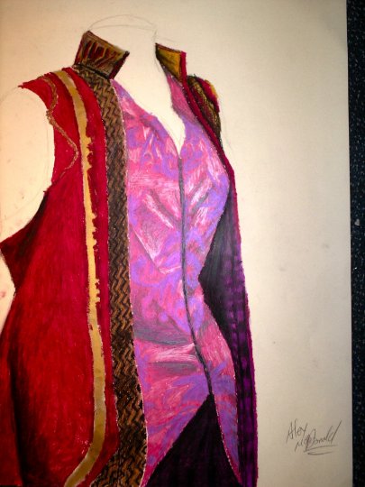
This piece was done during the 'drawing week' in which the students were given the oppertunity to try a few things they may not have done before, such as drawing figures in movement, drawing from a projected film or simply just to draw things like this piece of costume which doesnt get taken out very much. I think i did a very nice picture of this lavish red tunic thing and the colours i believe are very realistic however i was forever being hassled to try more experimental things and never really got to finish it the way i wanted. Instead i went off and did a very large piece with oilbar which i will have photos of sometime soon. I however like to make things that look a little more real, especially landscape. I find that being able to invent an entirely 'different' landscape to any you could find on earth is extremely fun especially for someone like me with an overactive imagination that can spend ages imagining what it would be like to stand in that landscape. |
|
|
|
|
|
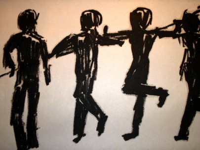 |
This picture was done with oilbar at the end of the 'drawing week' and was work done from dancers who were performing in the middle of the studio. the first few pages of sketches i did were life like and realistic but i didn't feel i was able to get enough of the movement onto papaer before the dancers had begun doing something else. So i decided to do this which more obviously relates to the movement rather than the acctual people performing the movements. |
|
|
|
|
 |
|
|
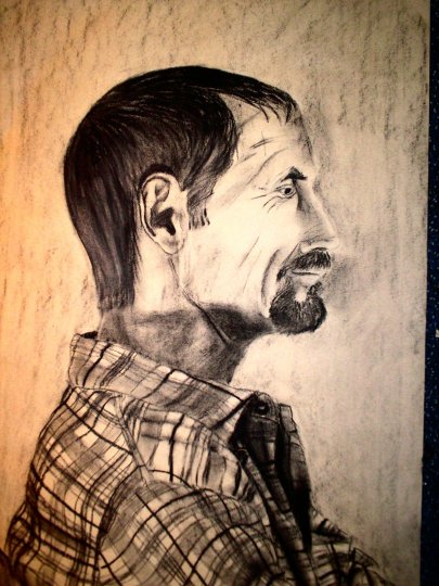
This picture was done in charcoal and is a portrait of one of the life models at the art college. I must admit that some of the detail in this picture is very nicely done whereas other parts are not exactly up to the same standard and this leaves the picture looking not entirely realistic. I do however really like the way i have done the man's flannel shirt. I think that it looks just about believeable. I think i spent most of the day on this piece and i think it was right after i had finished the one of Ailsa. |
|
|
|
|
 |
|
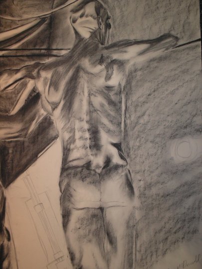
| This picture is another charcoal drawing of a life model at the art college. This one has far more dramatic lighting than the last one and i think that it really makes the head look very three dimentional and sculptural. i quite like this piece i must say but i would not say that my life model work is my best. I have a great difficulty in painting models as skin tone is a very complicated thing to try and emmulate. I am however learning the skills every day so sooner or later i will master it. |
|
|
|
 |
|
|
This is yet another life model from the art college and this one as you can see has been painted in water colour. i have to say that i dont think it looks very real but thats about all i'm seeing when i look at it. People have however told me that it looks quite good as a painting so i must have got something right. i must say i do like the torso, i think it may just look real enought to pass. |
|
|
|
|
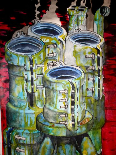 |
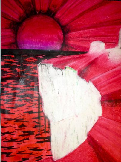
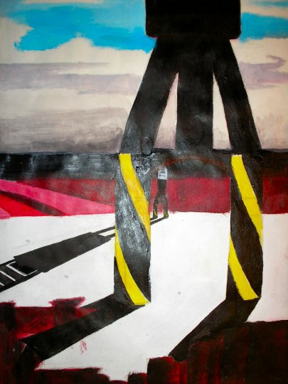
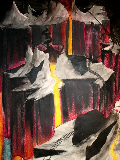
The following six pictures are a series i created based on a different series of photographs in one of the first few weeks of Art college. Though you could probably recognise which paintings relate to which photo i can assure you that the photos i took looked nothing like these paintings. The photos were mostly close-up's or of objects and structures out of context with nothing around them to give a hint of where they came from or even what they are. The painting on the left was based on some pipe clamps that were lying at the Dundee dockyard where i took most of my photos. I decided that i would take the elements from my photos and turn them into interesting landscapes so the piple clamps became towering smokestacks in a red ocean. The picture on the right was based on some red corrigated iron that had been a fence stopping people getting into |
 |
|
|
|
| The dockyard. As you can probably tell that didn't work. I was planning out the cliff and the red ocean that would link this picture to the one previous and the white towers that would link it to the next one when i realised that it would look really cool if i had the sun's beams being the corrigated iron. I think it looks rather cool. That picture was done with oil pastels and the sea was done with black and red ink. The picture below the first I based upon a really bizzarre piece of polystyrene i found quite near the pipe |
|
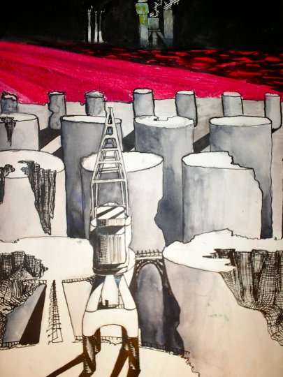 |
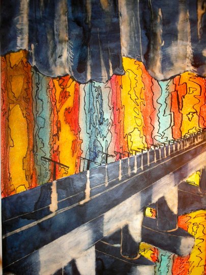
clamps. In this picture i decided to look back across the landscape to include everything i had shown before. So, in the background and on the horizon you can see the corrigated iron , the red sea and in the distance the towering smokestacks. This is also what the white mountains in the second picture were alluding to. The crane is a link to the next picture which was based on photographs i took of the dock's many giant cranes that have to be over a hundred feet high. I painted this picture with acrylics so i'm afraid it was shiney and relfected the camera flash in the middle. In the background you can see the red corrigated iron and above that i decided to paint a lovely blue sky with a think layer of black under it where i thought perhaps no light ever reached. The link to the next picture is the way the white ground seems to break away as a sheer cliff, an idea i had based on |
 |
|
|
|
| my own experience at the dockyard when i was wanting to walk along further only to find myself faced with a fenced off bridge across a water lock which was pouring water down to the sea level, about 30 feet below me. Anyway that picture links now to picture 5 in the bottom left which was based on the rails that went all over the docks for the old trains to recieve and deliver cargo. i also loosely based the picture on many other pictures i had taken: the cliff colours from a painting of old red paint the yellows and blues from rust etc. These probably would have been better planned had i not done all of them in one night basically. I got to sleep about 7 in the morning and got up at 9. The link |
|
 |
back to the last picture is the red cliffs decending from the almost white ground and the link to the next picture on the right is the orange and blue sea of lava in the bottom left hand corner which i had based on colours and patterns i had seen on rusted corrigated iron on the side of some dockland building. The picture on the right is the last of the sequence project and is a picture of horrifying perspectives that make your brain want to die if you try and work out which way things are alligned. The blueish black areas were done with black quink ink and then detail added in bleach and they show the bottom of the cliffs in the previous picture and a version of the tay road bridge advancing accross a sea of molten lava/corrigated iron. If theres one thing that this project taught me it was that i really do love making up landscapes. |
 |
|
|
|
|
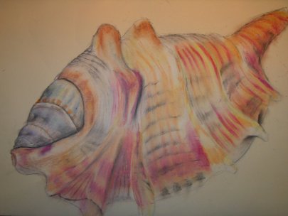 |
This shell was part of the same project that i did the picture of the bird skeleton for. however this piece is much larger as it is A2. a lot of people seemed to like this one for some reason, guess it must have been the colours or something but i think that it says shell pretty effectivly. I dont think i used this picture for anything though. The picture was done using oil pastels and i am increasingly believing what the art college tutors said about oil pastels being like peanut butter with food colouring in them, a much better alternitive would be oil bars which are a lot more like paint in a stick and are much more powerfull when it comes to colour |
|
|
 |
The following three photographs are of a sculpture i made in one of the early weeks of art college and was by far my favourite project so far.
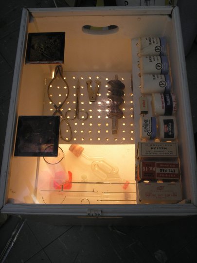
This was constructed sculpture so i made it out of things that other people had given away or thrown out and had found their way to the dundee recycling center which is a huge warehouse full of assorted industrial and household junk that you can buy at understandably low prices. |
|
 |
|
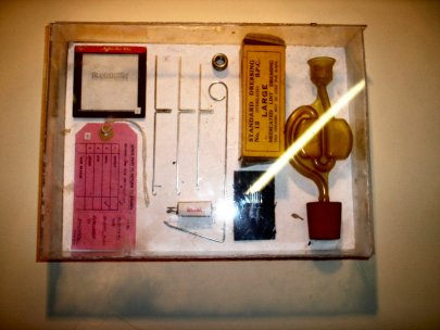
| What i decided to do with this project was to build something that was halfway between an arcane medical toolkit and a museum display of the same. For this look i knew that i would need to find some kind of display box so i bought some kind of old toy chest and fitted it with a light at the bottom as well as shelves made of wood and perspex and lined the sides at the bottom with white tiles. I then proceeded to fill the box with things that i hoped would look very medical even though as someone looking at the things inside you would have little or no idea what purpose they were meant to serve. I also arranged them in a way that showed diagnosis instruments at the bottom such as thermometers, surgical style instruments in the middle and things like bandages at the top. Then i sealed the box with a |
|
|
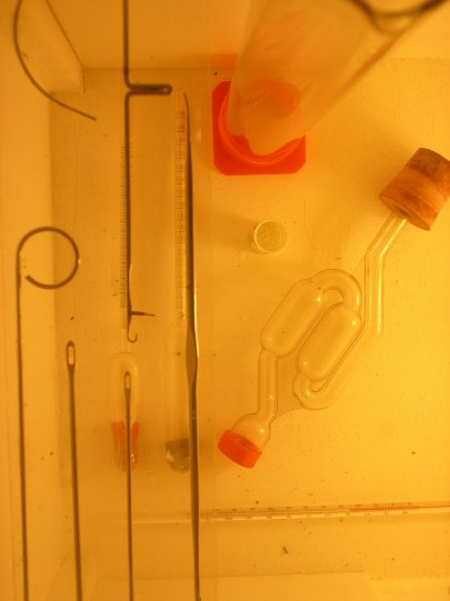 |
Perspex screen with slides of an archeological excavation which showed the bones of a bronze age man although as a viewer you wouldn't know that. |
|
|
This piece earned me the highest mark i had got up till that point for a course and i was very pleased. The photo in the top left is of a smaller sculture that i made to waste time and use up the last of the pieces i had bought for the sculpture. This piece also contains the only thing that i didn't buy from the recycling center and that is the circular bolt that is at the top next to the large yellow box.
As it turns out i enjoy this scupture on a daily basis at my flat as i took both back and the large piece now serves as a very nice bedside table. It's practical and very nice to look at. |
|
|
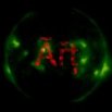
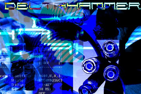
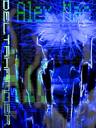
The pictures below were pieces of computer art i made for my DeltaHammer MySpace account and also an avatar and signature bar for forums. These pieces were supposed to reflect the electronic characteristics of DeltaHammer's music by incorperating many cyber goth style images as well as computer age references and industrial style images. Though the music of DeltaHammer doesn't really match the image that this kind of art portrays i'm hoping that by focusing on that style the music will follow as it has allways been an ambition of mine to create industrial, cyber, trancy music with lots and lots of synth.
These pieces also represent a slightly more developed understanding of the graphics software i have at my disposal. I'm hoping that someday soon i wont have to get images of the internet at all to make these style of pictures but that i will be able to create the entire thing from scratch in photoshop or paintshop pro or whatever i am using. |
|
|
|
|
|
 |
|
|
 |
|
|
|
|
|
|
 |
|
|
 |
|
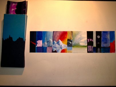
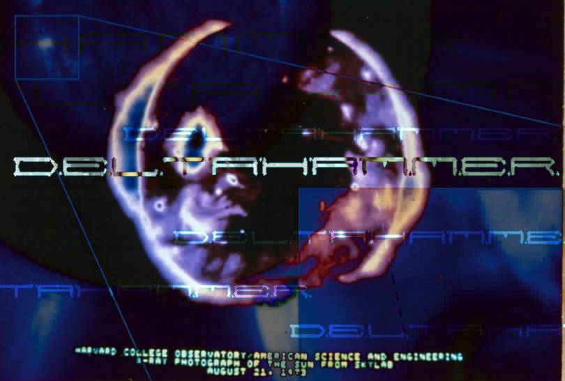
| The picture you see above is what i have decided is the main image for DeltaHammer. This picture will most likely feature on the cover of the first album with the pieces below featuring somewhere inside or on the back of the case. The picture on the left i am quite proud of though i'm not sure what to do with it. The pic on the right i have to say is probably too small to do much with though i have to say that it turned out quite well |
|
| The picture below is probably the most authentically mine as the basic background of this image is one of the pictures above from my portfolio, the picture based on blue driftwood. I am quite fond of that one and will probably end up using it as a poster or something like that. |
|
 |
|
|
|
|
|
 |
|
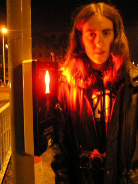
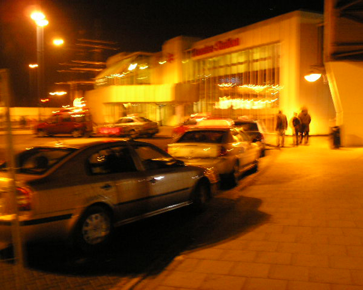
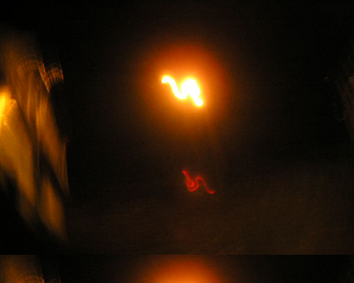
| The following photographs are taken from a project i am currently doing at art college based upon the city at night and all the lights and activities related to that. These photos focus on the lighting in the city at night and accompany a song i wrote called CityScape which will soon be online at www.myspace.com/deltahammer. you will also notice on that site that i have images attached to them from my portfolio. These are pictures i think best sit alongside the songs as they play and give a sense of atmosphere. The final production will be a film sequence which will have my song as the soundtrack |
|
|
|
 |
|
|
|
|
|
 |
|
 |
|
|
|
|
 |
|
|
|
|
|
 |
|
|
The picture to the left is from a series of Pictures i made on photoshop. This one was made with an avatar for a forum called darknessundressed however it seems to have crashed or something and i can't use it. Guess i'll have to find another forum to post these pics on. |
|
|