COLORIZED IMAGES
Sincerly,
Greg Ott
| PROJECT 2 COLORIZED IMAGES |
||||||||||||||||||||||||||||||
| Home | ||||||||||||||||||||||||||||||
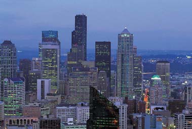
| ORIGINAL | ||||||||||||||||||||||||||||||
|
||||||||||||||||||||||||||||||
| This is the image that I originally started out with. I used this image because the city can be very unpredictable and different lighting can make it an interesting place to visit or a very relaxing place to visit. | ||||||||||||||||||||||||||||||
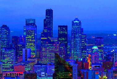
| NIGHTLIFE (Exciting) | ||||||||||||||||||||||||||||||
|
||||||||||||||||||||||||||||||
| If you look at this image, it seems like it is alot going on at night in this city. I used shades of blue, sharpened the lighting in the buildings. I also used alot of bright colors that will get you curious about what is going on in the buildings. | ||||||||||||||||||||||||||||||
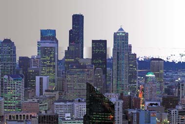
| DAYTIME (Neutral) | ||||||||||||||||||||||||||||||
|
||||||||||||||||||||||||||||||
| In this image I wanted it to go either way, calming or exciting. My dipiction of a neutral effect on the image to soften the lights in the building and clear up the sky a little with a gradient effect. Now, when you look at this image you come to your own opinion of what I the designer was trying to achieve. | ||||||||||||||||||||||||||||||
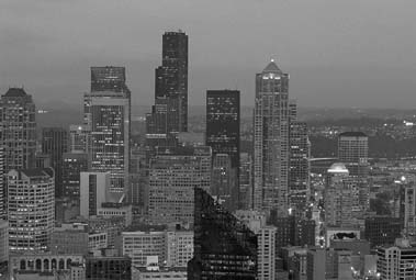
| STORMY (Calming) | ||||||||||||||||||||||||||||||
|
||||||||||||||||||||||||||||||
| Now, if you look at this image you automatically get a calming feeling. The cloudy skys relaxes you, makes you feel at peace. The dim lights tells you that it is not too much excitment going on in this city. It is amazing what effect that different shades of lighing can have on an image. | ||||||||||||||||||||||||||||||
| Thank you for your time. Sincerly, Greg Ott |
||||||||||||||||||||||||||||||