![]()
My Works
 I have done these two as a tribute of Wolfgang’s love for experimenting with typeface.
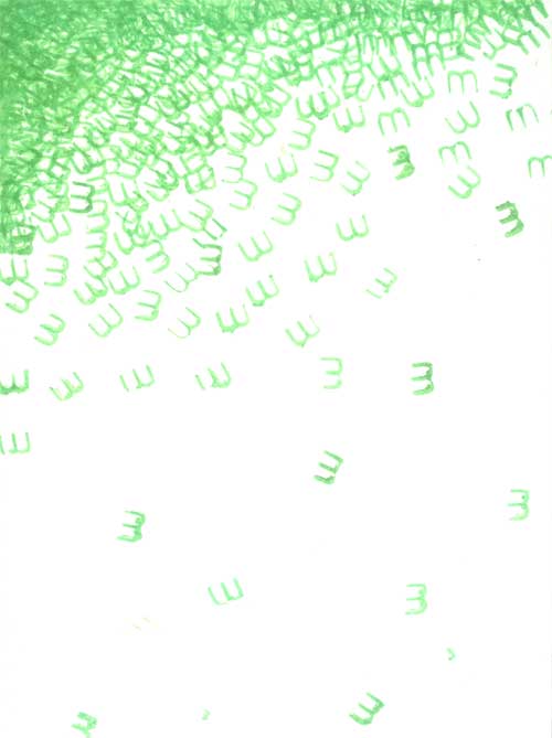
 I have noticed and loved his expressions of his works, created with limited typefaces yet pictorial.He also never hesitates to put emotions in his works, even those experimental works that he made.He experiments with every single thing like rotating and placing letters all over, hence I did this to see how he operates.Wolfgang has this thing of placing typefaces close and far to experiment the spacing and see how it affects the entire piece. That’s how I came out with the letter “M” with random spacing.
Why “M”? I saw one of his works that he experimented with the letter M a lot, and I guess this might be his favorite letter, so I decided to use this alphabet.All of his works have emotions, so I decided to try working it into my own picture. I try to create a feeling of displacement by having the illusion of “M” falling down, and at the end of the picture the letters are really far apart to further emphasize the feeling of displacement. I had the idea of using dandelions as a reference since when the seeds are released, they are blown by the wind and behave this way as well.
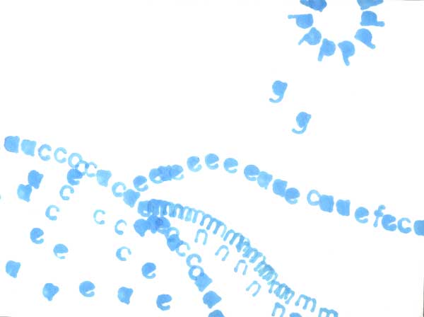
 This is a picture done using one typeface to create a picture. It is seen in Wolfgang’s works that he uses typefaces to create pictures/to portray his feelings and to experiment.The second work I have is an experiment of how Weingart uses typefaces to create pictures. It depicts a sunny meadow. I used as little alphabets as possible this time as I want to avoid the picture looking too cluttered and undecipherable. Wolfgang Weingart has this certain neatness in his work and most of his works are perfectly legible.
You can easily tell what it actually is at one glance, something that I hope to incorporate in this work.Sunny is usually represented by the color yellow, but because the paper is also white, and that I can’t use black paper because it’ll feel creepy with yellow on, I had to choose an equal color that is rather peaceful, hence I chose light blue.The letters “a”, “c”, “e” are perfect for the meadow as they are more curvy so it is easier to create the feel for the picture.