Technical Analysis provides visual measurement of trends and price activity in the financial markets. The most important factor in moving markets today is not supply and demand, but rather the forces which effectthe flux of supply and demand, namely market participant psychology. The application of technical study to the financial markets is the most efficient manner in which one can open a window to see the totality of market psychology, where people are buying and where they are selling.
Technical study is the study of this market action, for the purpose of forecasting future price trends. Technicians believe that the market discounts all news that most fundamental traders follow. For example, if XYZ company releases positive earnings for the quarter and then precipitously drops in price. An explanation for such activity, which we see increasingly often in today’s volatile markets, is that the positive XYZ company earnings were already factored “into the price”. Therefore, the technician approaches the markets as being efficient, and believing that an investor cannot get ahead by following the ‘old school’ fundamentals which may have worked in years past. The maxim 'buy on the rumour and sell on the news' was founded on such principles. We believe that the most efficient approach to investing in the modern day is applying a ‘techno-fundamental” approach.
Human psychology
tends to remain the same historically in the face of certain
situations. Therefore, basing investments on the expected price
action following a technical formation makes sense, as the
psychology of investors tends not to change over time. In
other words, technicians believe that history repeats
itself in these situations. The fundamentalists study
what caused the market to move, while technicians study the
effect. Technical patterns tend to repeat themselves as
they are simply a plotting of shifts in supply and demand, and
the forces that act upon same. These cycles, as the
business cycle at large, tend to repeat themselves
The charts in
Foreign Exchange Trading are usually drawn on the basis of daily
prices. The prices of different currencies are quoted from
different centres of the world for almost 24 hours a day. These
prices keep on fluctuating constantly on the basis of the genuine
commercial demand and supply as well as the speculative trading,
which in turn depend upon various economic, political and
financial factors.
While drawing a Bar Chart for a currency,
the prices of the currency at three different stages, viz. the
day’s highest rate, the day’s lowest rate and the
closing rate are taken into consideration. On the graph the
points indicating these three rates are joined by a vertical line
to form a bar as shown in Diagram 1.
The Chart records
every trading day with such line or bar. A Bar chart drawn for
the period of a few days would look somewhat like the one shown
in Diagram 2. it may be observed that the opening price for a day
does not necessarily be the same as the closing price on the
previous working day.
The Charts are
analysed by studying the trends depicted by different types of
configurations, which are as follows:-
The uptrend line
is drawn along the daily lows and should connect as many points
as possible. Within the trend certain reactions and deviations
are common. As long as the market closes above the trend line the
movement is intact. The trend is confirmed if the new rally
closes above the high of the previous one as shown in Diagram 3.
This line is
drawn along the peaks of daily Bar’s, connecting as many
points as possible. The downward trend is confirmed as long as
the rallies do not close above the trend line and the reactions
close below the previous low as shown in Diagram 4.
When prices are
rising, they may reach a point where a selling interest is
created for profit booking etc. Renewed selling will stop the
trend whenever it develops again and therefore prevent further
rise as shown in Diagram 5.
When prices are
declining they may reach a point where buying interest will be
activated. This buying interest will support the market and be
reactivated whenever the price drops back to this support level
as shown in Diagram 6.
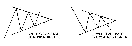
These are consolidated configurations.
Symmetrical triangles can be
characterized as areas of indecision. A market pauses and
future direction is questioned. Typically, the forces of
supply and demand at that moment are considered nearly
equal. Attempts to push higher are quickly met by selling,
while dips are seen as bargains. Each new lower top and
higher bottom becomes more shallow than the last, taking on the
shape of a sideways triangle. (It's interesting to note
that there is a tendency for volume to diminish during this
period.) Eventually, this indecision is met with resolve
and usually explodes out of this formation (often on heavy
volume.) Research has shown that symmetrical triangles
overwhelmingly resolve themselves in the direction of the trend.
With this in mind, symmetrical triangles in my opinion, are
great patterns to use and should be traded as continuation
patterns.
7.
ASCENDING TRIANGLES:
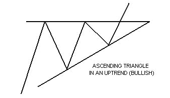
The ascending triangle is a
variation of the symmetrical triangle. Ascending triangles
are generally considered bullish and are most reliable when found
in an uptrend. The top part of the triangle appears flat,
while the bottom part of the triangle has an upward slant.
In ascending triangles, the market becomes overbought
and prices are turned back. Buying then re-enters the
market and prices soon reach their old highs, where they are once
again turned back. Buying then resurfaces, although at a
higher level than before. Prices eventually break through the old
highs and are propelled even higher as new buying comes in.
(As in the case of the symmetrical triangle, the breakout
is generally accompanied by a marked increase in volume.)
8.
DESCENDING TRIANGLES :
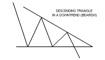
The descending triangle, also a
variation of the symmetrical triangle, is generally considered to
be bearish and is usually found in downtrends. Unlike the
ascending triangle, this time the bottom part of the
triangle appears flat. The top part of the triangle has a
downward slant. Prices drop to a point where they are
oversold. Tentative buying comes in at the lows, and prices perk
up. The higher price however attracts more sellers and
prices re-test the old lows. Buyers then once again
tentatively re-enter the market. The better prices though,
once again attract even more selling. Sellers are now in
control and push through the old lows of this pattern, while the
previous buyers rush to dump their positions. (And like the
symmetrical triangle and the ascending triangle, volume tends to
diminish during the formation of the pattern with an increase in
volume on its resolve.)
9.
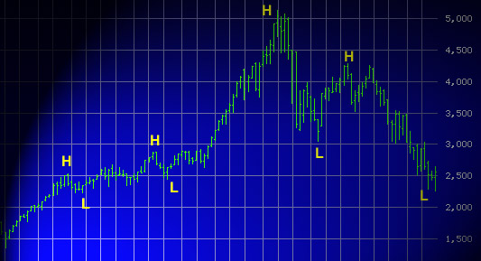
DOUBLE TOP & DOUBLE BOTTOM :
A double top is formed when a currency advances to a certain level with high volume and after reaching a peak retreats i.e. falls, then comes up again to round about the same price with some pick up in volume and falls down a second time for a major decline. The happening of fall through the valley floor in the second activity is considered of major importance and when this happens enter a short position in the currency.
A double bottom is the exact
reverse of a double top and here where the second rise takes
place and cuts through the valley floor and moves up, go long in
the position of the currency.
10.
TRIPLE TOP & TRIPLE BOTTOM :
This type of formation is quite
rare. The three highs need not have to be at the same price and
the three valleys need not bottom out exactly at the same level.
When the decline from the third top breaks through the level of
valley floor sell the currency. One feature of the triple top is
that the last leg does not penetrate the lowest point of the
valleys. Instead, it gets reversed and goes back through the top.
At that point one should buy the currency. A Triple Bottom is the
exact reverse of Triple Top with all criteria seen upside down.
11.
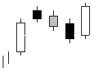
HEAD AND SHOULDERS UP :
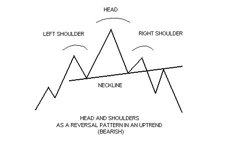
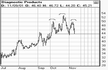
The head and shoulders pattern is generally regarded as a reversal pattern and it is most often seen in uptrends. It is also most reliable when found in an uptrend. Eventually, the market begins to slow down and the forces of supply and demand are generally considered in balance. Sellers come in at the highs (left shoulder) and the downside is probed (beginning neckline). Buyers soon return to the market and ultimately push through to new highs (head). However, the new highs are quickly turned back and the downside is tested again (continuing neckline). Tentative buying re-emerges and the market rallies once more, but fails to take out the previous high. (This last top is considered the right shoulder.) Buying dries up and the market tests the downside yet again. Your trendline for this pattern should be drawn from the beginning neckline to the continuing neckline. (Volume has a greater importance in the head and shoulders pattern in comparison to other patterns. Volume generally follows the price higher on the left shoulder. However, the head is formed on diminished volume indicating the buyers aren't as aggressive as they once were. And on the last rallying attempt-the left shoulder-volume is even lighter than on the head, signaling that the buyers may have exhausted themselves.) New selling comes in and previous buyers get out. The pattern is complete when the market breaks the neckline. (Volume should increase on the breakout.)
12.
HEAD AND SHOULDERS DOWN :
The head and shoulders pattern can sometimes be inverted. The inverted head and shoulders istypically seen in downtrends. (What's noteworthy about the inverted head and shoulders is the volume aspect. The inverted left shoulder should be accompanied by an increase in volume. The inverted head should be made on lighter volume. The rally from the head however, should show greater volume than the rally from the left shoulder. Ultimately, the inverted right shoulder should register the lightest volume of all. When the market then rallies through the neckline, a big increase in volume should be seen.)
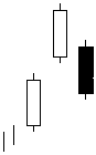
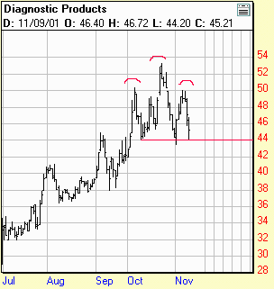
HEAD AND SHOULDERS AS A REVERSAL PATTERN IN AN UPTREND (BEARISH) |
|
|
|
Head and
Shoulders Pattern spotted on |
|
13. MOVING AVERAGES :
Moving
average is one of the most simple technical tools among others.
Although momentum is a simple technique as well, it is based on
only two points and therefore is not as accurate as the moving
average. A moving average will use all of the prices within a
chosen time period. In order to trade many markets with a moving
average (trend-following tool), it is necessary to have rules:
when to buy, when to sell, crossing signals, long term average or
short term average, envelops or Bollinger Bands. A
trend-following tool enters the market after prices have clearly
changed direction. It is not possible to capture the whole trend
and profit from the entire rally, but a moving average shows you
straight away what is going on this market.
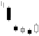
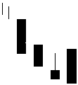
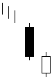
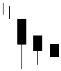
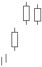
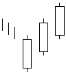
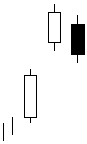
A
candle chart originated in
Bullish Candle Patterns |
|
|||
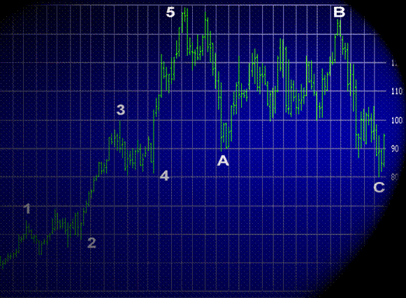
The
Elliott Wave Principle is a system of rules for interpreting and
forecasting price action. Elliott has created a new language:
wave 1, correction wave 2, impulsive wave 3. The basic Elliott
Wave pattern: five waves in the direction of the main trend
followed by three corrective waves. Waves are given numbers and
letters to facilitate the identification. A complete Elliott Wave
market cycle is composed of eight waves and is a part of the
Fibonnacci Sequence, which reflects a constant relationship
between its components. The Elliott Wave Principle and certain
measuring techniques, with sometime an incredible accuracy, have
fascinated some analysts and this technique has become their main
technical analysis tool. They call themselves
"Elliottist". Both Elliott and Fibonnacci discoveries
have interesting aspects and financial markets seem to be driven
by "Nature's Law". The stock market has a
predisposition to establish patterns, which can be aligned with
the form present in the Fibonnacci Sequence. The occurrence of
Fibonnacci ratios in the markets is not a coincidence and you
will learn how to take advantage of those numbers in your trading
strategies
90 years after
Dow's death, Dow Theory is still the best technical analysis tool
to predict market directions. Dow Theory is considered as the
grandfather of all technical analysts. Without this theory,
technical analysts recognize they would be blind. We will focus
on the general tenets of the theory and how to apply it to all
the markets. The strongest part of the theory lies in the
recurrence: whether we look at currencies, interest rates,
indices or commodities, the investor immediately knows if the
market is trending up or down. This theory can be applied to any
time frame, from a five minutes chart to a monthly or yearly
chart.The Dow Theory also covers the study of support and
resistance. Most well-known patterns are also based on Dow's
discovery. Not using Dow Theory is like driving a car without a
brake pedal. The other strong aspect of the theory is its
implementation to money management. Money management deals with
the question of survival in the markets and increases the odds
that the investor will survive and handle its capital. You will
learn the basics of the Dow Theory and you will be able to follow
any market and any time frame of related to this market.
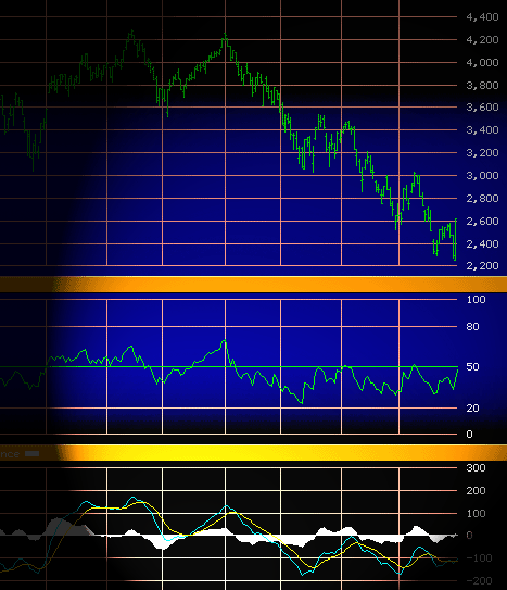
Combining
momentum indicators can warn of latent strength or weakness in
the price being monitored, often well ahead of the final turning
point. The methods of trend determination are considered
extremely useful (Dow Theory, trendlines, price pattern and
moving average), but all of them identify a change in trend after
it has taken place. We will examine the general principles of the
momentum, relative strength index (RSI) or stochastic. The
concept of momentum is very similar to a ball thrown in the air.
The speed at which the ball rises will sooner or later gradually
diminishes until the ball finally reaches a temporary standstill.
Prices, whether rising or falling, are following the same
principle. Using indicators helps one to locate potential
"standstill" and major turning point. From convergence
to divergence signals, from oversold to overbought warning
signals, indicators and oscillators are your radar device and
warns the investor to adopt defensive action by partial
profit-taking or the use of tighter protective stops. While the
RSI will highlight oversold or overbought condition, the
stochastic is the best trending tool ever invented. With the
moving average convergence divergence (MACD), the investor sees
straight away what is going on. A mix these indicators with the
Dow Theory, patterns, bar chart or candlestick chart is
essential.
CHART
INDICATORS
valley floor and moves up – Go short
the valley floor and moves down – Go long
valley floor and moves down – Sell the currency
the valley floor and moves up – Buy the currency
the top – Buy the currency
through the bottom
– Sell the currency
The above are
only a random selection of formations of graphic representations
of price movements and their interpretations. One needs to be
taking into account various changing parameters while evaluating
the graphs and using them in rates forecasting. Thus one needs to
exercise ones mind in the selection of which price to be
represented in the graph – start of day, particular time of
day, end of day, mean of the above etc.
Even the type of chart to be used, whether line chart, bar chart etc. should be carefully selected. As regards the period, rate movement captured in the graph may change during the day, during the week, during the month, during the quarter, during the year etc. Here again one has to be careful to ensure that the time span is representative and typical and that the particular time span chosen is not pertaining to a period during which an unusual event occurred. While interpreting the graph one may also study the volumes of business done at different price levels to find out specific price levels when large volume purchase or sales are triggered. This analysis may be done for different markets for the same currency or share prices etc. to study holding patterns. Again while viewing the graph one can study the rate of change in the price movement and its momentum, which can be used for projection of forecasted rates. In sum, one needs to take into account various parameters both in the construction as well as in the interpretation of price movement charts.