Hard copy is hard copy.You can read it , experiment it , prepare notes and
lot. So why read online samples when you can own a full copy for less than 4$
.Email [email protected] to buy hard copy
of the same. If you think the excel book can be improved please email the author
at [email protected]
Home
Regression analysis can also be plotted graphically using
the ‘Trendline’ methodology of the EXCEL. Let’s go step by step to understand
the same.
- Click on Insert – Chart and you should be popped with
a chart wizard as shown in below figure ‘Chart wizard’. Select chart type
‘Line’ because that will give us more clarity for viewing ‘regression’
analysis. Once the ‘Line’ type graph is selected click ‘Next’.
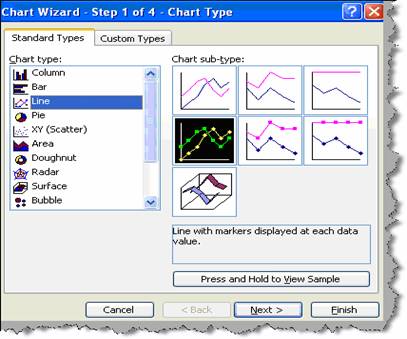
Figure: - Chart wizard
- Once you click next you will popped with a dialog box
as shown in figure ‘Add X and Y axis’. Click on add series and supply the
‘X’ (independent) and ‘Y’ (dependent) values. In short supply the sales in
the ‘Y’ axis (values) and marketing expenditure in the ‘X’ axis (Category X
labels). Once the X and Y values are supplied click finish.
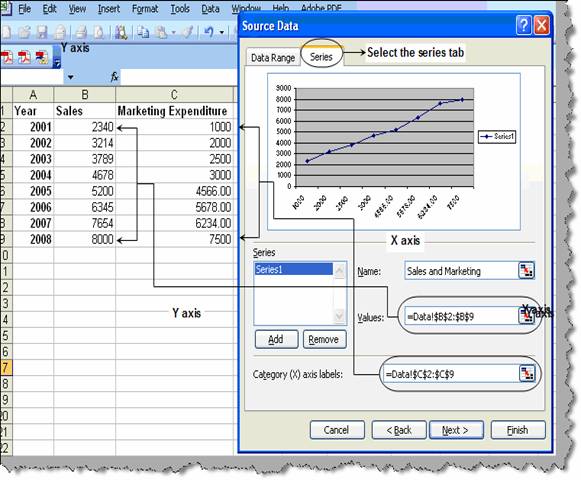
Figure: - Add ‘X’ and ‘Y’ axis
- Once we have clicked ‘Finish’ you should see a graph
as shown below. Select the graph line and right click on ‘Add trendline’.
You will then be popped to select which kind of trend line you want ,
currently we will select ‘Linear’.
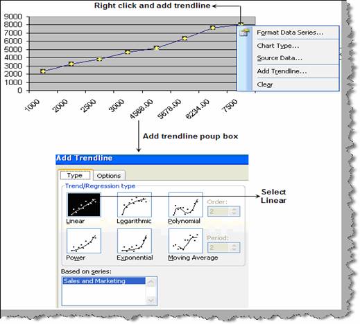
Figure: - Add trendline
- We will also go to the ‘Options’ tab and select to
display the linear equation and the R square value.
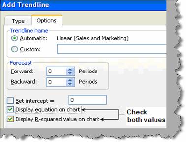
Figure: - Display equation checked
- Once you have filled the ‘Add trendline’ dialog box
inputs click ok. You should see something as shown in figure ‘Linear
equation graphically’. You can see it has displayed the linear equation ( y
= 833.45. X + 1402 ) and the R square value (0.98).
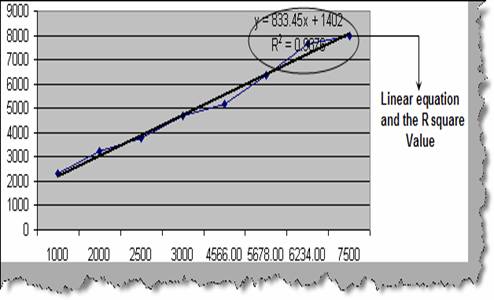
Figure: - Linear regression graphically
Once we know the relationship we can easily use the same to
forecast for any dependent variable.
Note: - Try to experiment the same using logarithmic,
polynomial, power, exponential and moving average type of graphs.
Hard copy is hard copy.You can read it , experiment it , prepare notes and
lot. So why read online samples when you can own a full copy for less than 4$
.Email [email protected] to buy hard copy
of the same. If you think the excel book can be improved please email the author
at [email protected]
Home