
About Me
Hello, I’m Evan. I am a graphic and web designer with a strong passion to become a front-end web developer. I have had a strong passion for art and design since I was young and decided to pursue a career graphic design. After a I obtained my associates degree in graphic design I stepped out into the work force and held a few part time positions as a graphic designer, but it was a position as a printing press operator that taught me a great deal about the print industry that I feel carries over to my career as a designer. I worked in the print industry for eight years until my wife and I had our son in 2015. At that point my wife and I decided that it would be a good time for me to stay at home with our son and go back to college to pursue my bachelor’s degree in graphic and web design. I have now finished my degree at Southern New Hampshire University and am ready to tackle the next stage in my life. Please feel free to contact me, I look forward to hearing from you, working with you, and getting to know you.
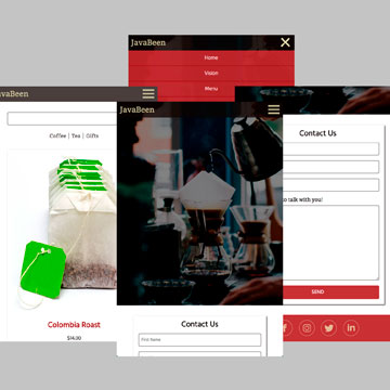
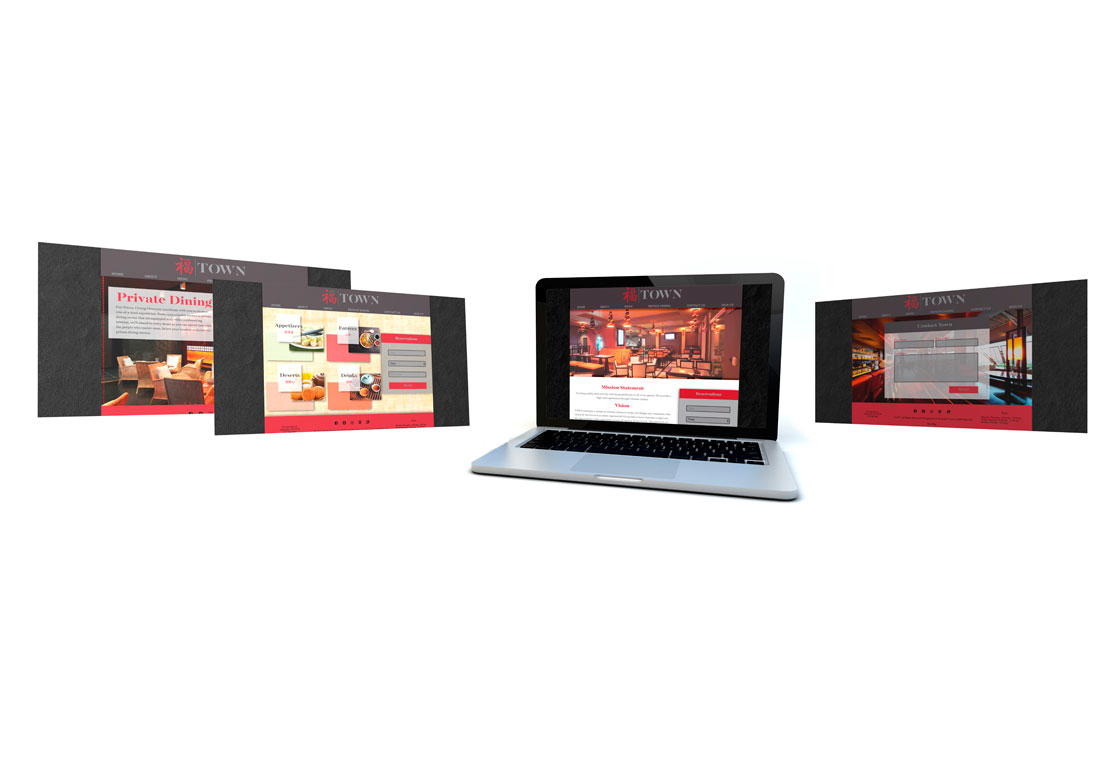
Web Design
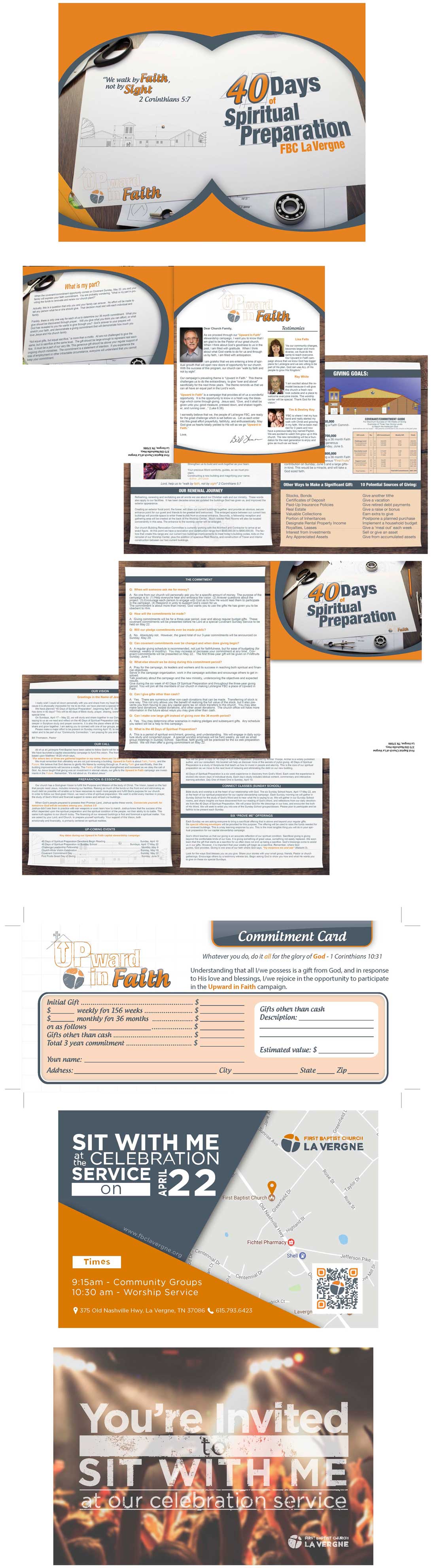
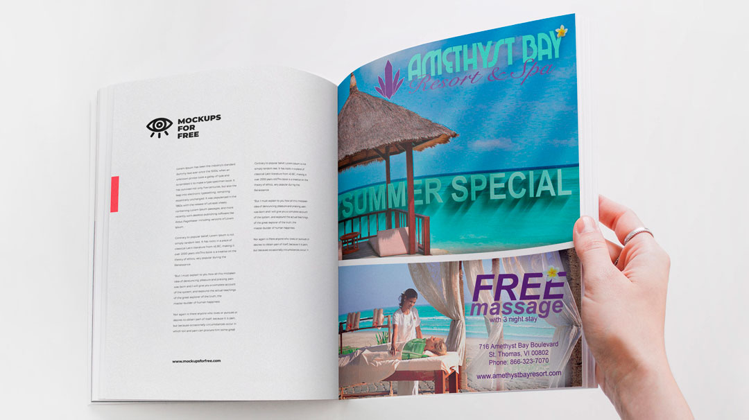
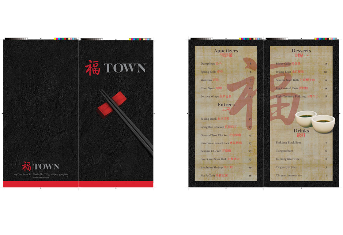
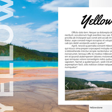
Graphic Design


