Some examples of the development of the thesis project
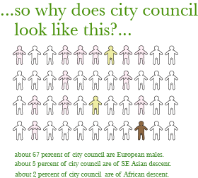
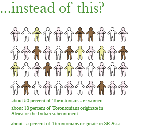
The subject of democratic representation that is addressed in my thesis project began with an observation of how the city government of Toronto is constituted. In spite of Toronto's multiethnic citizenry, the democratically elected representatives end up being mostly males of European descent.
The representation of information as a continuum rather than as an absolute is interesting. Mapping and graphing often tends to make information appear more clearly delineated than it actually is. My aim was to show frequency of sampled events using opacity. In the case above, the appearance is the result of 5% overlays. The density of colour is the result of the number of superimposed overlays.
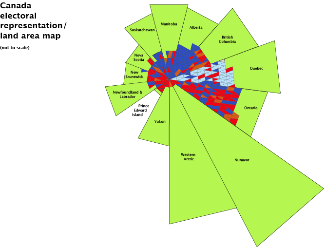
This was an attempt to deal with the great variation in population density characteristic of Canada. This cockscomb map does succeed to some extent, but is still not to scale, and results in an overemphasis on provincial boundaries, and does not lend itself to the depiction of complex voting behaviour, as the electoral districts occupy a relatively small part of the availble area.
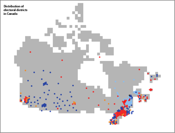
Initially, the concept of using transparencies to represent voting percentages was done on geographical maps based on the map of results of the 2006 Canadian federal election supplied by the government of Canada. This does have the advantage of enabling some voters to quickly see percentages of vote in their district. This is much less succesful in the case of the urban districts seen in the bottom left and right corners, where both scale and individual district names are difficult to discern. Shown is vote percentage for the Conservative party.
This map attempts to emphasize the relative irrelevance of geography by rendering Canada's shape in a pixel map. While it does succeed in showing the distribution of electoral districts, and the relative importance and democratic weight of urban areas, the insistence on geographic scale means that it is almost impossible to meaningfully use overlays to show voting percentages, as most of the available visible area is not used to represent information about voting behaviour.
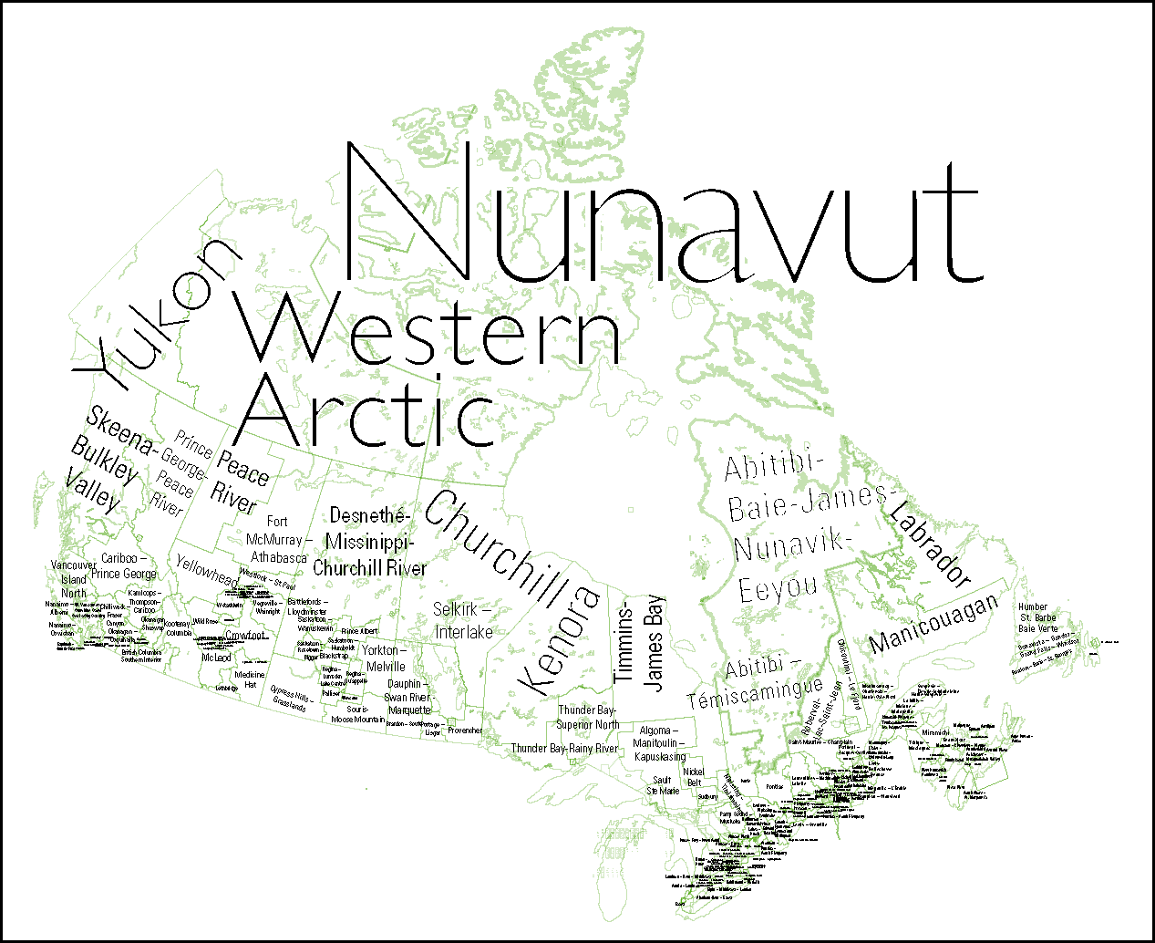
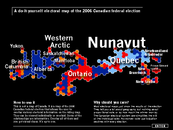
This approach was interesting, as it emphasized the political lines of force in the constitution of the federal government more than the geography. However, it distracted from the equality of the power of ridings in forming the government, and again provides a somewhat misleading and irrelevant representation of the scale and form of geography.
This approach was interesting, as it emphasized the political lines of force in the constitution of the federal government more than the geography. However, it distracted from the equality of the power of ridings in forming the government, and again provides a somewhat misleading and irrelevant representation of the scale and form of geography.
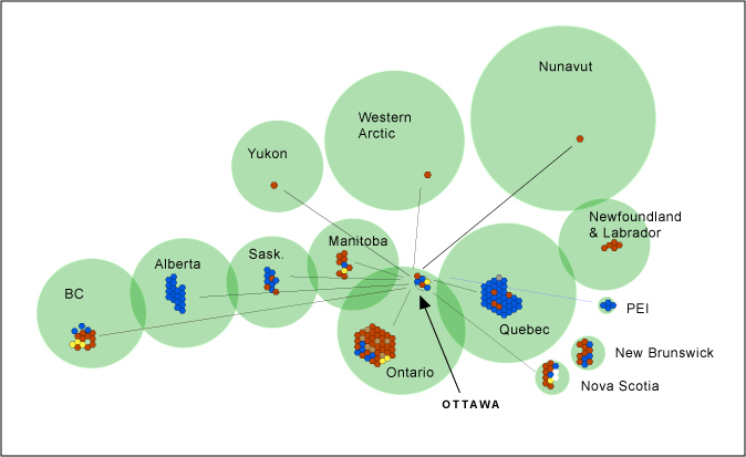
The idea of making a map that used larger, lighter type for sparsely populated areas was attractive, because it gave the impression of relative size and density, without there being any risk of it being taken as an actual representation of data.
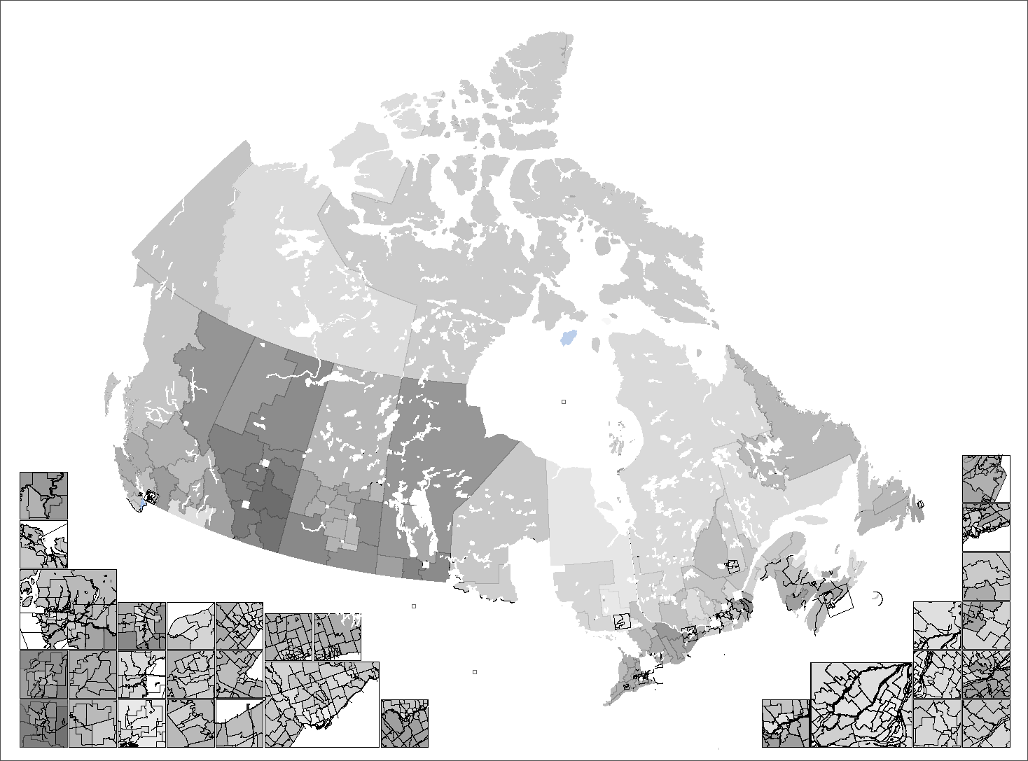
Eventually it became clear that accurate and useful representation of electoral districts was impossible, while represesentation of provincial areas was difficult, and largely irrelevant to the federal electoral process. Above is an earlier version of the opening page with elements of the preceding approach.