Excel Charting Tutorial
![]()
Open Microsoft Excel Click in Cell A1 Gather your data that you will enter into the cells. Begin to enter your data in the first cell. (In this example a grade level survey was taken on students' favorite TV programs.) |
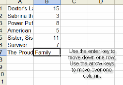 |
| To move and enter data into the cell to the right, click on the Tab key To move and enter data into the cell beneath press the Enter key. |
|
In the above picture, you cannot see all of the data. You can change the width of the cell. Move your cursor between columns A and B, a crosshatch cursor will appear. |
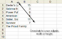 |
| Double click between the columns (A and B) and the column width will automatically adjust to fit the text. You can also do this when number data does not fully appear. | |
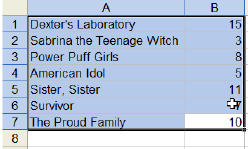
To create a graph you should click in the first cell that contains your data. Next, drag your mouse across all your data. |
 |
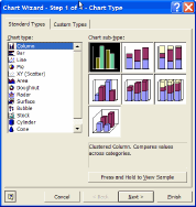
Find
the chart wizard in the toolbar above and click on the icon. |
|
The graphing menu will then appear. Select the chart type that you want. (We will be selecting the column graph) |
 |
| Then click on "Next" in the bottom of the menu. | |
| When you see the data range shown, click next. | |
The next screen that appears will ask you to give your chart a title. We can name this chart, "3rd Grade Students Favorite TV Show Survey" |
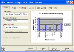 |
Then you should name the Category X axis. You will see the TV programs listed. So we will name this TV Show Names. |
|
| Next, you will label the Category Y axis. In this example it is the number of students who voted for their programs. So will will label it, "Number of Student Votes" | |
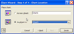
Finally click on Finish to complete your chart. A menu will appear, select as "Object in Sheet" or a new sheet if you would like to print out chart separate from your data.
|
 |
You will now see your finished product. You can resize your graph by clicking on it, and holding the the resize handles. Congratulations on making a graph! |
 |