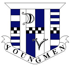
First off, the colors of the logo are pretty straight forward. The DV Youngmen jerseys consist of white and navy blue. The crest itself has three strong and simple colors, those being white, navy blue, and black. The team will always somehow consist of these colors since they represent strength and straight-forward thinking.
Probably the hardest part in the creation of the logo was the shape. The edges are sharp and clean. The flair at the top of the crest gives a bold statement, and along with the ribbon at the bottom, frames the whole picture. The two vertical white stripes are significant. They actually helped decide the shape of the logo. The jerseys have a stripe of color beginning at the pit of the sleeve continuing down each side. These two vertical white stripes represent the style of the jerseys. When the time comes for new jerseys, this pattern on the Crest will represent the roots of the team and give a 'retro' feel, should our new jerseys not have these stripes.
For the most part, the horizontal white and blue stripes were added as 'fluff'. Just some filler to give the Crest some character. But if you really want to pick it apart, the bold lines can represent strength, where the thinner lines can represent unity. The four squares found in the center of the crest were not an accident though. Many medieval shields have a similar pattern. Soccer, or rather, football, is an age old sport. This ties together with the medieval theme. The shield characteristics reflect a strong defense and core.
Lettering. The D and V represent Drayton Valley respectively. The team was founded and formed by Drayton Valley players. The core of team remains from DV, and without the dedication and spirit of these players, the team would not exist. They are hand-drawn as opposed to simply being created from a fancy font. The passion for the game is shared by the team as a whole, and this passion and dedication are found in the curves and complexity of the letters. The letters are placed above the crest to show that the team is and forever will be a Drayton Valley team. DV teams are known for their victories against all odds, having a small population base, but a very strong heart. Many of our players travel over two hours just for one game!
And finally there are the black and white checkers. It was known from the start that this would be incorporated into the crest somehow. This chess-board pattern represents the unique style and philosophies of the team. Chess is a wordly game, one involving extreme skill, concentration, and offensive and defensive thinking all at the same time. |