360 Haverhill Road | Boston, MA 02115 | 978-360-3000
[We're here for you]
Documentation of the Development Process
The main purpose of my uncle's website is to introduce the business in a friendly manner and provide information for clients as well as potential clients. The website eases the ability for viewers to learn about the company as well as contact my uncle in regards to inquiries or scheduling. The design is pretty simple because the overall objective was to create a comfortable welcoming environment that is easy to navigate. This way clients can find the information they need quickly and efficiently.
Defense of the Final Product
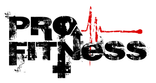
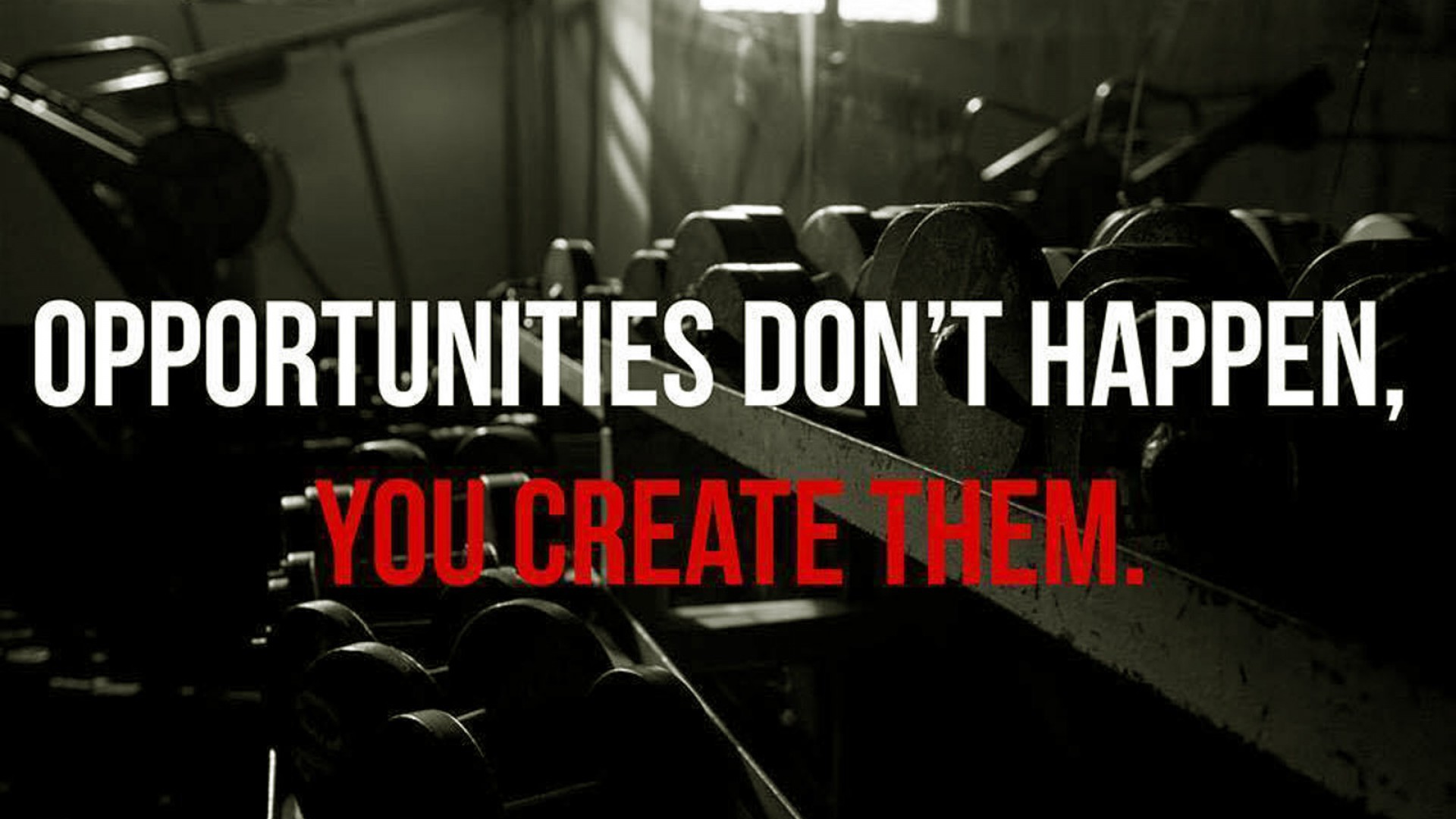
Some specific design choices I made for the website are the color scheme, menu location, typography, and format. The color scheme is a mix of red, black, gray, and white. The color scheme plays an important role when designing an interactive website because it is the first thing a viewer will notice when visiting a website. The color scheme serves as a means of communication and allows the website to stay professional while delivering the right message in the right way. The red is the power color and resembles energy as well as passion which goes well with exercising. The other colors may seem dark but overall working out is not an easy task. At times with everyday life schedules, it seems almost impossible to exercise consistently on a weekly bases. The red is there to remind clients that energy and determination are all you need to overpower tough obstacles in life. I tried to stay consistent with each page format and typography by displaying the header, logo, and page menu at the top to ease the navigation process. With this, the viewer will always know what page they are on and allow them to find what they are looking for promptly. The most desirable outcome you expect from your design is to make people impressed with it. Typography helps achieve that. Appropriate font selection and proficiency in typography will make your message more legible and easy to grasp. The line length, font size, and character rendering and other typographical elements should be displayed adequately. Otherwise, users may feel distracted and annoyed. Using the proper methods in typography will reduce eye strain and fatigue. It will encourage the user to read more and pay attention to your design.
Opportunities for Improvement and Growth
The future design ideas for my website are endless but if I had to select a few it would be to add more pages and hyperlinks. First, I'd consider adding a page for clients to view and schedule appointments online as well as receive feedback promptly. Another addition would be to include a photo and biography individually connected through a hyperlink about each personal trainer within the company. Some things I may have done differently if I had more time and resources would be to experiment with different page formats and layouts. I'm still a rookie when it comes to website design and I feel I haven't even scratched the surface of what is available in regards to webpage design ideas.