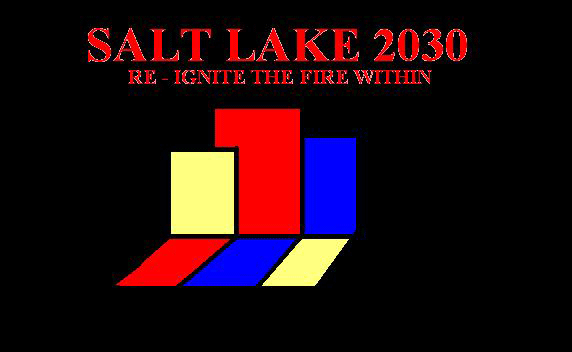
This is logo #1 also called the "Block Logo." This shows the rising of a new age in the shadows of the old. If you remember right the original logo for the 2002 olympics looked something like this. (Well, not very close, I mean this picture was drawn in 20 seconds on my computer.)
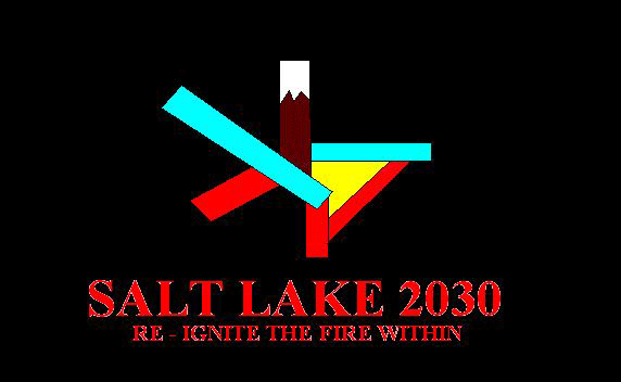
This is the "speed-skater" logo. It originally started as a new version of the 2002 logo, but it mutated into this. This logo includes 6 sticks (one with a mountain, two colored blue and two colored red). These sticks represent the 6 cities that will host the games inbetween the two times Salt Lake will host the games. Also included is a red stick with a yellow glow over it, representing a sun rise.
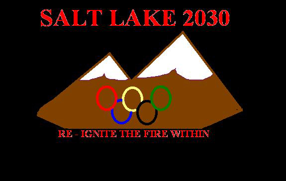
This is the "mountain" logo, and just looking at it I see it needs to be re-done. I am attempting to capture the olympic rings made of lights that was on the side of the mountain during the 2002 games. I failed. However, I think if I just work at it, this one may be okay.
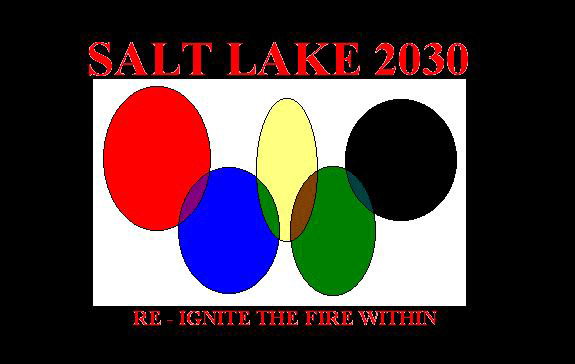
The "shades" logo. It's five overlapping circles. It's supposed to be a new version of the Olympic flag.
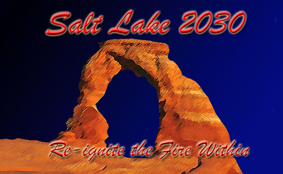
The "Non-Logo" logo. It's not actually a logo, but looks really cool anyway. So, I had to include it. As you can see, after some time, I can actually learn how to draw. If you didn't know, this is suppose to look like Delicate Arch in Southern Utah
That's the logos for now, tell me which one you like best, or draw your own (with explaination) and e-mail them.
Last Updated June 27, 2005. Copyright 2005 - 2030 SLOBC