 |
|
|
|
|
|
|
|
|
|
|
|
|
|
|
|
|
|
|
|
|
|
|
|
|
|
|
|
|
|
|
|
|
|
Page 9 |
|
|
|
These are some new signs I designed for the park. |
|
|
|
 |
|
|
|
 |
|
|
|
|
|
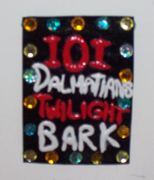
This one was simple but much more themed than the original one. |
|
|
|
|
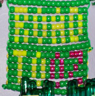
The picture isn't so great, but if you squint and pull back you can kind of read bewteen the beads. |
|
|
|
|
|
|
 |
|
|
|
|
 |
|
|
|
|
|
|
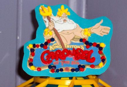
I just added some 3D elements to this sign. I liked the art but felt that it was lacking, so I think the clay adds something. |
|
|
|
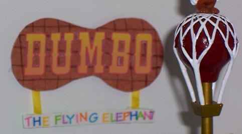
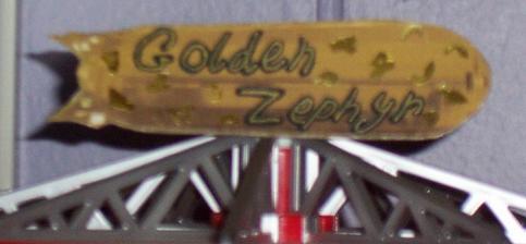
This is supposed to be representative of the K9 Krunchies billboard. |
|
|
|
|
|
 |
|
|
|
 |
|
|
|
|
|
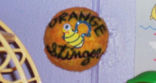
This one was the coolest to do, but also the most painfull. I cut a tennisball in half and then colored it orange. That wasn't even the hardest part. Then I had to superglue it to the wall. |
|
|
|
|
|
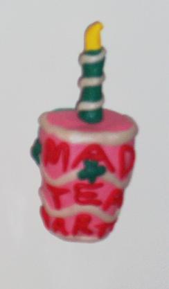
I liked the old sign, but felt like there were too many teacups in the area, so I opted for something a little different. |
|
|
|
 |
|
|
|
This was the first in the new wave of signs. I got a little bored between projects all right!! The old sign for this was just thrown together since I had no idea how to theme it. This one at least has a little more thought put into it. |
|