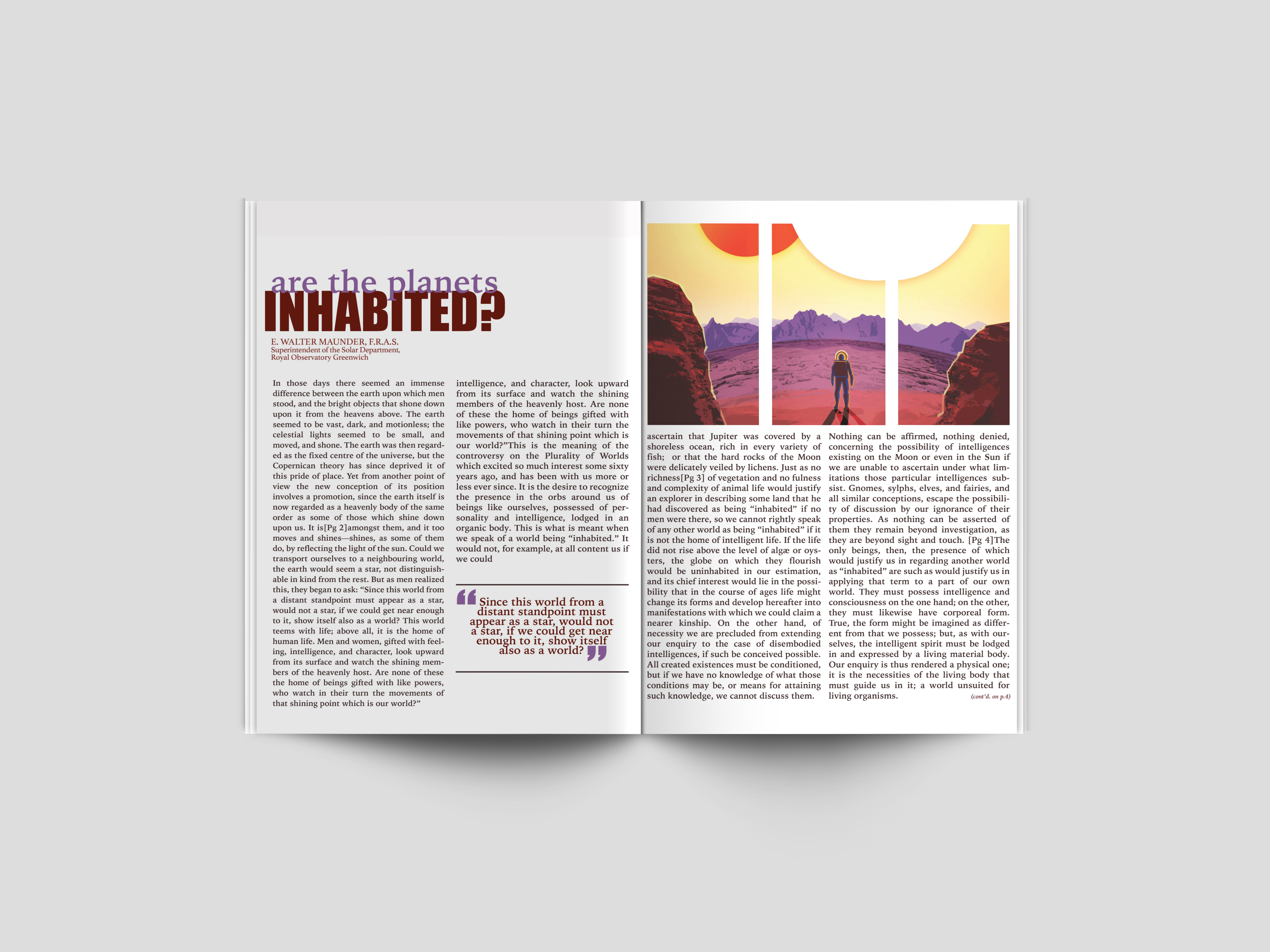
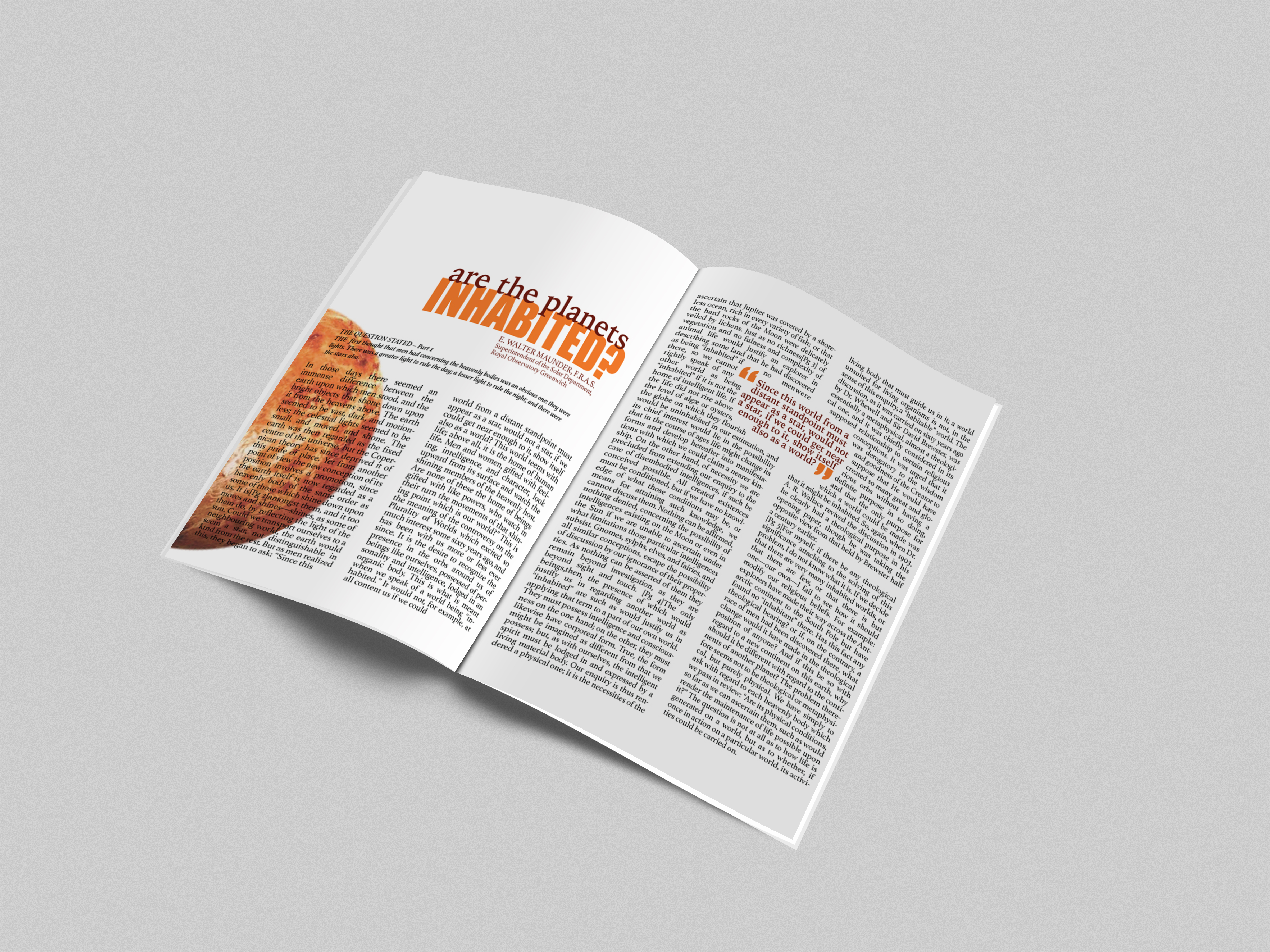
Both of these spreads were created using the same copy. The intent of this project was to showcase how one subject could be translated to the audience in two different ways.
"Are the planets inhabited?" This question which has plagued mankind for generations was chosen as the basis for both of these magazine spreads. Subtle variations were made between the two designs.
Even though the differences between these two spreads are subtle enough to seem insignificant, this is not the case. This project is an examination into the use of design elements. How do these different elements communicate a mood or a theme? Color effects us on an emotional level, as well as a visual. The cooler color palette of spread one may seem more inviting than the warmer color palette of spread two. Especially when you take in to consideration the subject matter of the magazine at hand. Imagery helps in this case as well. The photo in spread one is of a man visiting some distant, unknown planet. This photo almost seems peaceful and relaxing, some sort of futurstic getaway. On the other hand is the fiery planet showcased in spread two. This photo elicits feelings of fear and anxiety.