Project Definition
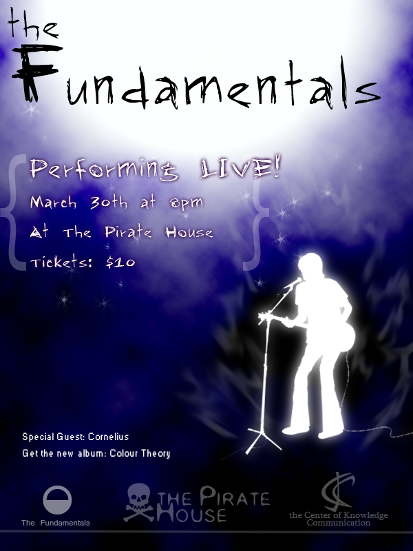
My client is a punk rock band called, “the Fundamentals.” The goal of this project is to create an effective, eye-catching flyer that would advertise the band’s up coming concert. Since this is a punk rock band that is infused with a little jazz and mellow hip hop, the target audiences are from 14 to 27 years of age. However, the band is relatively unknown; therefore, the theme must give some hint that this is a musical event. The event is held at The Pirate House on March 30th at 8:00 p.m. and ticket shall be $10.00. Special guest is Cornelius and sponsored by the Center of Knowledge Communication.
Design Decision
After considering the suggestions that I’ve gotten from the class, I’ve made a few changes to my design. Instead of using too many font types, I’ve chosen to use only 2. For the band’s name and the required copy portion, I changed them to a san serif type font called, “Rap Jack”. It gives it a funkier look and makes it seem more modern and energetic, which hint the band’s style of music. I’ve taken the outer glow away from the band’s name for better readability. I added the, “performing LIVE!” line to the flyer which let the reader knows that this will be some sort of an entertainment event and enlarged the size by a bit. I’ve also changed it’s out glow to a darker tint of purple. I placed the 3 logos that I’ve made to the bottom of the flyer and made them slightly alpha. I left the band’s logo a bit brighter than the other two to make it stand out the most among the three. I also removed the sponsorship section from the extra copy portion, admitting to its redundancy and then I nudged them a bit more to the right.
Logo 1:
![]()
For this logo, I designed it with simplicity in mind. I used a half filled circle because it’s a very fundamental shape. With this design, it is easily recognizable. It is also easy to be printed on almost any type of surface and material. I used a san serif font type called, “Kartika” and centered it under the logo to give focus and order to the design.
Logo 2:
![]()
In this design, I focused on the initial of the band’s name. I played with it and give it a relaxed feel which gives hint to the audience of the band’s music style. I placed logo after than band’s name to break away from the tradition. I used an almost comic like font called, “Kristen ITC” which has round soft elements that compliment with the logo.
Logo 3:
![]()
This design feels practically strong to me. It has a shield that gives a sense of order. But at the same time, it is also a guitar pick which is intended to suggest to the audience that this is related to music. The merged TF is very sharp and pixilated, which contrast greatly with the outer border.
Extras:
![]()
![]()
I also designed these two logos for the location and the sponsor and added them to the flyer design. I wanted to give the flyer a more professional feel with actual cooperate affiliations.
Work Cited
iStockphot.com: http://www.istockphoto.com/file_closeup/who/698018_solo_indie_guitarist_artist.php?id=698018
Usage: guitar clip art was used in a non commercial respect.
Free Fonts: http://www.1001freefonts.com/fonts/ofonts.htm
Usage: Fonts were used for the title and required copy text and according to its respective guideline.