Analysis of older work
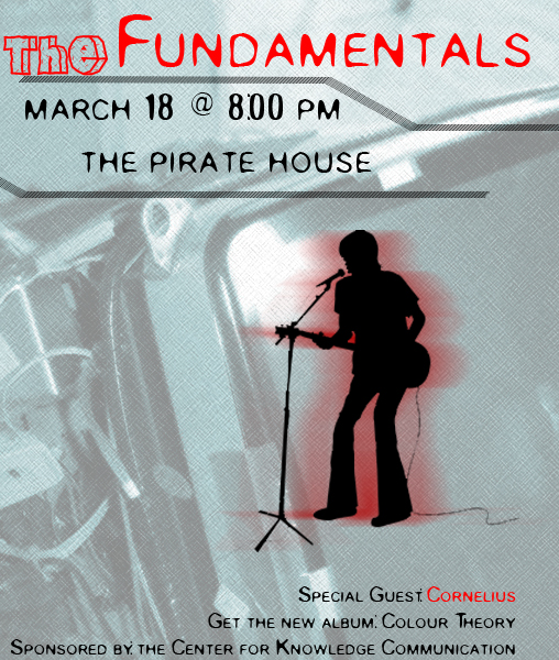
For this, I choose to talk about the design that I edited in assignment 2 that was originally from assignment one. This is because I feel that the font type I used in it is particularly interesting. The name of the font is called, “Old English Text MT”. I’ve chosen this font because it helps carries the colonial era theme. I wanted to embrace the Pirate theme since the location of the place is, “the Pirate House”. I know that failed in the sense of representing the band. But this decision was made because of the band non-popularity. For the extra copy portion, I used a font called, “Small Fonts”, this break away form the theme and gives it a contemporary look and it is easy to read.
Redesign

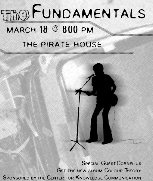
Black and White
Since the client could not afford to have the flyer in colors, I have made a black and white version of the flyer that would be photocopy friendly.
Work Cited
iStockphot.com: http://www.istockphoto.com/file_closeup/who/698018_solo_indie_guitarist_artist.php?id=698018
Usage: guitar clip art was used in a non commercial respect.
Free Fonts: http://www.1001freefonts.com/fonts/ofonts.htm
Usage: Old English Text MT was used for the title and required copy and according to its respective guideline.
---------
< back