 |
 |
 |
 |
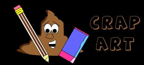
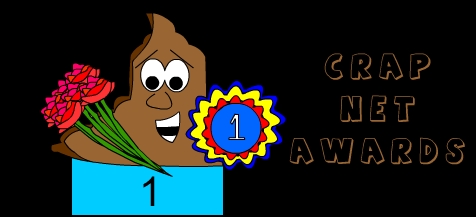
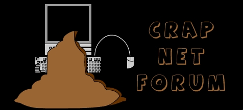
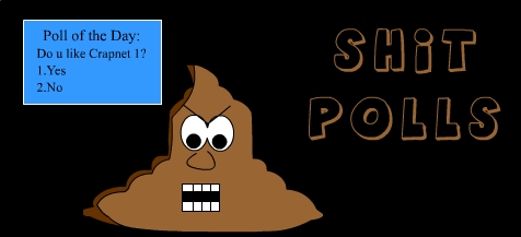
| When I started thinking of things to put in the "Roots" section of Crapnet, I began to ponder upon major factors contributing not only to Crapnet's begining as a website, but the inevitable changing ways of the site. One of the key elements that immediately came to my attention is the layout and overall feel of the website from its creation to this day. When I began Crapnet, my entire source of inspiration was The Omega Jumpstation. Not surprisingly, when I began to design to the site, the design looked disgustingly similar to OJ's. The question was even raised by Henri on the old Crapnet message boards regarding the blatent plagerism going on, but I won't get into that right now. The website, with crapdude as its mascot had a simple design, with the banner created by Henri (still in use) at the site's top, and with borders on each side. Links were provided in the form of banners. Each banner featured the newly-formed Crapdude (or Crapguy as he was first called) doing something related to the content which the link would lead to. Links back in the day included those for "Crap Art" (now simply "Crap"), "Shit polls" & "Crapnet Forum" (Now Forums and Polls) and "Crapnet Awards" (A category now extinct.) As you can tell, the very first Crapnet created in late 2002 was minimalist to say the least. |
 |
 |
 |
 |
 |
| Above: Old Crapnet Link Banners |
 |
| In the same year 2002, I just could not stand the ugly layout anymore. Though I had attempted to recreate Henri's website, it had failed horribly, resulting in my own ugly mass of turd (which you might think is appropriate to the website, but I assure you, it was not.) That year, the Cash Money Records craze was quite prominent in North America, and I was a regular at the Rap company's website. The former colour of the website was a yellow-orange one, and the layout was a flash-based one, with an intro page, an intro movie and frames. Though I knew my HTML skills were nowhere as developed as those of the professionals behind the website, I thought I'd give it a shot. After many tutorials, HTML help forums, copy and paste codes, and buffed up flash knowledge, I soon made a website remarkably similar to Cash Money's. As for the colour, I soon discovered the HEX colour code system and through trial and error, had found the colour "Goldenrod". I fell in love with the flower-named shade of abnoxious yellow and had decided to use it as the background colour for Crapnet. The new website, besides providing a snazzy new look for the site, is where much of Crapnet's current content had begun to develop. The characters page for example had been thunk up after viewing Cash Money website's profiles of their artists, the Downloads page mirrored that of Cash Money's, while the overall style of the old website had still been retained in one way of another. Kevin's discovery of the Proboards Forum system had also caused me to switch my forum location to that of proboards. With the remarkable customizing functions of the board, the new board matched the new website in its colour and layout. As I drew from various elements, the website was finally begining to look the way I had envisioned it, thanks to various sources of inspiration. The process of mixing the old and the new is percisely what defines the evolution of the website, as I began to draw inspiration from new things, while maintaining bits and pieces of the old, working towards a better Crapnet. |
 |
| Above: A banner from the good old days |
|
 |
| As satisfied as I was about the new Crapnet layout, the flash-based design was a pain to handle, as I would have to make a new flash file each time I wanted to update. The frames were also quite the pain in the ass to work with, and thanks to cookies, sometimes an update would not even be seen by the viewers. In the summer of 2003, I began to renovate the website once again. My avid fascination with the Adam Sandler website at the time caused me to ponder upon a website design similar to that of Sandler's home page. The design was colourful, simple yet nice-looking, and most importantly, was not flash-based, but rather image-based, with flash incorporated into some parts. The decision to make an image-based website was a logical one on my part, as I was far better at creating images in flash than creating flash in flash. The Homestar Runner webpage also inspired the new change in layout, as I once again borrowed things I liked from various places and combined them into one big massive turd-fest. of a website. The layout, as far as I was concerned was finished, combining not one, not two but THREE shades of goldenrod, a snazzy new look and loads of space for future layout to be put in. Currently, the website is still heavily short on actual content, but is definitely making progress. Perhaps when the website is more furnished with material rather than layout, another header will be added on to section, illustrating the constant evolution of the website. |
 |
 |
| Above: A few goodies |