


Here’s a layout for On the Go Magazine. I created the cover, table of contents, and the feature article layout. Consistency was kept with the persona of the magazine, which is clean, simple, and quick. The reader is someone who is constantly busy and moving from one thing to the next. Our goal is to give them ways to use their time more efficiently in easy to digest chunks of information. With using a simple white background and images relating to the content effectively, this layout can be read and retained easily.
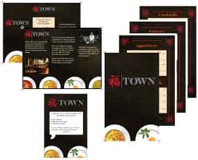
TOWN is an upscale authentic Chinese restaurant. They want their customers to feel dining with them is an experience and not just about eating. They serve authentic Chinese cuisine in a relaxed atmosphere that invites people to enjoy their meal without rushing. They also offer specialty Chinese cocktails and live music on the weekends. The music is local artists whose sound fits with the relaxed atmosphere.
I was asked to design their menu, table tent, and a brochure. All three pieces had to express the mood of the restaurant as well as staying authentic to Chinese culture as the restaurant does. I used simple and clean design while staying with their color palette to create an intimate menu and table tent. The brochure is intimate and inviting. It uses the same color palette and highlights the other features of TOWN such as their live music.