Welcome to (yet) another tutorial by moi... I have no clue what the layout has to do with anything, but nonetheless I hope you enjoy it! ^_^
Okay, so you wanna create effects as seen on someone's blogthatIforgottheaddressfor:
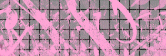 �  �� 
Starting with the first one, which I will call "Graffiti a la Flashdance", for its delightful use of the hot pink 80's color scheme:
- Making the graph: Okay, I'm just gonna assume that you want the same style background as the original picture (the grid/graph paper looking effect), so I'll include that in here. If you just wanted to know how to do the graffiti itself, skip to the next step.
There are several ways to go about this, and they all produce pretty much the same effect. I've chosen what I believe to be the method that produces the best results for the shortest amount of time, using the Tiling Effect.
-First, you'll need to create the background that the grid-effect-thing will go on. Make a new image, 166 x 56 pixels (I decided to make my image the same size as "messy.gif", so we'll go with that for the sake of clarity), and fill it with the desired background color. The original image background is gray; I decided to make mine a little cheerier with a delightful robin's egg blue ^_^ ;p
-Next, go under Effects > Texture Effects > Tiles... and select "Square" for the tile shape. Go ahead and play around with the values until you get a look you like, probably something similar to the settings I used to produce the desired effect.
If this method does not produce results to your liking, there are other ways to go about it, as I mentioned earlier. One idea is to go under View > Change Grid and Guide Properties, set the spacings to somewhere around 10-15 pixels, press OK, then go back under View and select Grid. There should be a grid displayed on your background now; simply take a screencap of it and cut the new image out of the screencap. Or you can just draw all the lines manually...
-You can always go over the lines with a different color (or just draw them by hand to begin with).
- Okay, so now we're ready to draw on our graffiti. Add a new layer, pick a color (I used pink too), and get out the ole' airbrush
 The rule here: The more solid and sharp-looking you want your graffiti to be, the the higher the values. If you want it to look more like graffiti, decrease the density of the airbrush, and set opacity and hardness to somewhere between 30 and 50. Add a little step to it. Vary these factors as you go, even change the color and the brush shape a couple of times, and you should get a pretty good-looking graffiti effect. It's your creative license ;) The rule here: The more solid and sharp-looking you want your graffiti to be, the the higher the values. If you want it to look more like graffiti, decrease the density of the airbrush, and set opacity and hardness to somewhere between 30 and 50. Add a little step to it. Vary these factors as you go, even change the color and the brush shape a couple of times, and you should get a pretty good-looking graffiti effect. It's your creative license ;)
-You can use the eraser in random places (again with varying values) and the retouch  tool to enhance the effect. Try the Smudge and Sharpen effects under the Retouch Tool. tool to enhance the effect. Try the Smudge and Sharpen effects under the Retouch Tool.
And here is the end result:

Not bad, considering I did that one in like 2 minutes. You could get the exact same effect as the one from the blog, but since I just wanted to do a quick demonstration I made a half-assed crappy one ^^;. Just takes a lil' more time and effort. ;) So there's Effect no. 1!
Moving right along...
You'll find that this next effect is even easier. Again, there are so many ways of achieving this effect� you might want to use one, or a combination of all...
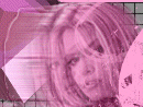
- First, you'll need to prepare the image you'll be using for the effect. I decided not to go with Ms. Anderson, but I did choose another person's head. Obviously, this can be done with any image, the only requirement is that it has been cut out to the exact part of the image you want to use, and the rest is transparent. So go ahead and cut the picture out from whatever source you're using, copy and paste it as its own image for future use, then paste the image as a new layer on a brand-new image, the layer below should be filled with whatever background color you want. So now you should have one layer with nothing but the image you want, and the layer below it is filled with the background color.
- Okay, time again to take the initiative and use your creative license ;p. You can choose to do this any of the following ways. I recommend a combination of more than one effect if just one doesn't get the results you want.
-Underneath the top layer (but in front of the background, of course), create a new layer and paste the image on it like you did with the top layer. From here, you'll start the actual effect. One way to do a motion effect is the obvious "Motion Blur" effect, by selecting Effects > Blur > Motion Blur, and adjusting it as you wish.
-Another is to use the clone brush, or the Retouch tools Smudge or Push (the step should be set to at least 30 for the effect to work correctly... just test it with different values again until you get it exactly as you like).
-The easiest way to do it, imho, is by using the Wind Effect. Go to Effects > Geometric Effects > Wind and let it blow, baby ;p.
- Now just repeat the same effect a few times, building up the layers underneath the original top layer, using the effects with less strength as the layers ascend. This is optional; if you liked the effect with one layer, then keep it there, or even just doing it on the original top layer if that's the effect you wanted. I did my effects with about 4 layers, using all of the methods above on the different layers, and varying each layer's transparency. It would probably have looked better if I had remembered the Wind Effect earlier. ^^;; I finished with a teensy, very, VERY weak smudging effect on the original top layer:

*Hmmm... that text probably would've turned out better if I hadn't used text that was unreadable in the first place ^^;;
Special thanks to Mr. Zedong.*
Last, but not least, we come to the 3D squares. Before I say another word, I want to make it clear that you'll get faster, better results from a 3D program than anything you could manually create on PSP (though the person who made the original graphics more than likely used PSP and did it by hand, 'cause the 3D isn't all that great in that picture ^^;; I mean, like, it's great, but not as great as that of a rendering program. So, I guess what I'm saying is that you can recreate their effect in PSP, but if you really want perfection and want to save some time, just run it through a program, and your squares will look better than the ones shown here and on the blog. ^^;;). So, if you want to save a lot of time and trouble and have the results look even better, go download a 3D program (I have used Amapi. This appears to be different than the one I used way-back-when, though... probably even better...).
Otherwise, I'll try to teach ya how to make crappy pseudo-3D squares:
- Okies, get out the shape tool
 , and select Rectangle. Make sure that the Antialias and Create as Vector boxes are checked, but that the Retain Style is unchecked. Pick a color for the fill... I guess it can have a stroke color, but it probably won't work too well if the square is outlined... I recommend no stroke color. , and select Rectangle. Make sure that the Antialias and Create as Vector boxes are checked, but that the Retain Style is unchecked. Pick a color for the fill... I guess it can have a stroke color, but it probably won't work too well if the square is outlined... I recommend no stroke color.
- Now select the bottom layer again (the raster layer) make another square, lowering the light and saturation on the color a teensy bit, and draw it right next to the other square. You should now have two squares on separate vector layers and the blank original raster layer. Remember to put each new square you draw on a new vector layer, so it's easier to manipulate and to allow for change to one particular square if needed. Here's where this gets tedious:
-Holding down the SHIFT button, skew the square downward a bit so it's now more like a parallelogram (hehe... that just made me think of "Like a Virgin" for some reason... I'm sure Madonna would have had an even greater hit with "Like a Parallelogram", don't you think? Or maybe "Like a Rhombus"...), as seen here.
-Use the SHIFT key or the CTRL key, or both at the same time to get the shape at the angle you want. Now make another rectangle (on its own layer, of course ^_~), this time on the bottom, the fill color even darker and less saturated, as this will be the bottom of the cube. Skew it and skew it 'till you can't skew no mo'. The SHIFT and CTRL keys will be used at the same time more often with this rectangle. Basically, just keep skewing and resizing until you get a decent-looking shape.
-Fit the other rectangles to the bottom as necessary.
-Patience is the key... ya just gotta keep trying with this one. ^^; After a few minutes of manipulation, I quit, since this is just for an example and... I got a... shape-thingy that looks kinda like a cube:

Yours should be better, since you'd be taking your time with it...
And so ends our tutorial...
Hope it was helpful in some way! Good luck! |
 |
 |


)
)
)
)
)