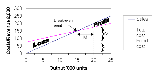
This idea of break-even point is also used by firms to depict that level of output where sales revenue just equals total cost. To find this point on a graph we need to plot fixed costs, variable costs and sales revenue against output, when the break-even point is where neither a profit nor a loss is made - hence the use of the term break-even.
Example
A firm makes only one product, which sells for £10.
The variable cost per unit is £5 and
fixed costs total £75,000 pa. Maximum capacity is 25,000 units per annum,
but the firm is presently operating at only 80% capacity. The graph below shows
the break-even chart
drawn from this information.
|
Break-even is reached at 15,000 units when sales just equals total costs of £150,000. Output of less than this amount results in a loss, while greater output makes a profit. The size of profit or loss at any output can be read off the graph at a glance, being the vertical distance between the total cost line and sales line.
Margin of safety
Also represented on the graph is the margin of safety which
represents the proportionate fall in output which can take place before a loss
is incurred. In this example, the present level of output of 20,000 units can
fall by 25% to 15,000 units before a loss commences. Therefore
the margin of safety is 25%.
Limitations of break-even charts
It is probably true that break-even charts are seen more
often in textbooks than in real life. This is because the charts have some severe
limitations. Clearly, costs do not move in a
linear fashion across a wide range of activity levels. Nor does the product
mix ratio stay constant in a multi-product firm. Any change in the mix will
invalidate a chart as total sales value and total variable costs will vary with
the mix. Finally, a chart cannot predict how many sales will be achieved at
a certain price - that can only be attempted by market research. A break-even
chart can only predict what profit will be made for a given selling price over
a range of possible sales volumes.