 |
|
|
|
|
|
|
|
|
|
|
|
|
|
|
|
|
|
|
|
|
|
|
|
|
|
|
|
 |
|
This was originally two pictures slapped on together with a gradient shading. This was also produced about 2 weeks before the production of the others, so I readjusted this to create a single picture. This mecame more eye appealing to the viewers now.
Self Rating: 9.345/10 |
|
|
|
 |
|
This was originally an image within my head, so I went with what works best. Simple enough, but works perfetly fine.
Self Rating: 9.165/10 |
|
|
|
 |
|
|
|
This was a bit hard to create. I had the image on my mind, but finding the right pictures was a bit hard to do. Though it may not be what I imagined, it worked pretty well.
Self Rating 9/10 |
|
|
|
 |
|
This was pretty cool to make. The concept of this signature as to create an illusion of a background while the foreground had this character in this. Worked out pretty nice, but the foreground character has some kind of white glow to him...
Self Rating: 9.15/10 |
|
|
|
 |
|
Originally, I wanted this picture for one of the later signature, but I believed that this worked fine. The position of this character worked pretty well, and I think that this was simple, although the creation of the box screen took a while.
Self Rating: 9.545/10 |
|
|
|
 |
|
|
|
I really like this one. This was somewhat simple, which led me to believe that this was one of my top three in this set. I tried the box screen again and worked out pretty well.
Self Rating: 9.765/10 |
|
|
|
 |
|
This signature was a bit decisive. I was considering to use a different picture, but in a way, this worked pretty well. This shows a sense of peace, which I liked, so I kept this concept in mind and placed the picture in the right area for the best visualization.
Self Rating: 9.215/10 |
|
|
|
 |
|
I liked this one a lot. I used the box screen concept on the character by using lines and angling it. This was supposed to be replaced with a picture from one of the other ones, but this worked pretty fine.
Self Rating: 9.55/10 |
|
|
|
|
|
 |
|
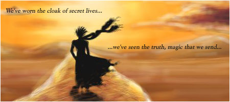
This was my original concep from my imagination. I saw this picture of the assassin, and it gave me a spark in my mind, which let to the creation of the set. I liked it as it was, so I did not edit anything on this.
Self Rating: 9.5/10 |
|
|
|
 |
|
Considering what this signifies, this worked out perfectly. I know that this was from a Zelda game, but the innocence and purity of the characters gave me the perfect setting for this. I considered this pretty good in concept.
Self Rating: 9.755/10 |
|
|
|
 |
|
|
|
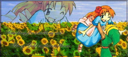
This is simple. This is a bit too simple. I could not think of what to put in this as a perfect background. I started as a battleield, but could not find one. I then switched to a type of dragon background, but the dragon was too large, so I ended up with this background.
Slef Rating: 8.75/10 |
|
|
|
 |
|
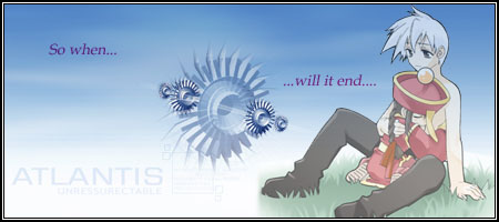
This last one of the set. I really liked the look on the character's face, which worked well with the quote. The concept was to make the character poped up from the background. The concept worked, but the adjustments of the character may be a bit off from the bottom.
Self Rating: 9.325/10 |
|
|
|
 |
|
|
|
 |
|
|
|