Self Rating: 6.45/10
Self Rating: 6.55/10
Self Rating: 9.2/10
Self Rating: 8.8/10
Self Rating: 7.65/10
Self Rating: 9.6/10
Self Rating: 9.65/10
|
||||||||||||||||||||
| The first of seven. This was mad by cropping a wallpaper and placing a light blue gradient behind the Spore. Simple, but ratehr dissapointing. Self Rating: 6.45/10 |
||||||||||||||||||||
|
||||||||||||||||||||
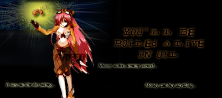
| The second of seven. This was pretty good, but the black bacground was real plain. I took a wallpaper and cropped it behind the gradient of the pouch. I could have done better, but it is more better than the first with its simplicity. Self Rating: 6.55/10 |
||||||||||||||||||||
|
||||||||||||||||||||
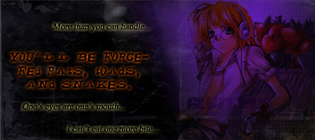
| The third of seven. I believe that this was far more better than the previous two. The screen fades in perfectly and the texture of the dark areas work well in this situation. Self Rating: 9.2/10 |
||||||||||||||||||||
|
The fourth of seven. This was originally like the concept of the 'Greed' signature. I reeditied this and the outcome looked quite well. It is not the best, but far from the worst. Self Rating: 8.8/10 |
|||||||||||||||||||
|
||||||||||||||||||||
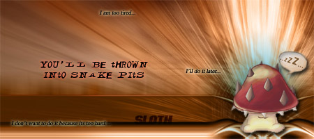
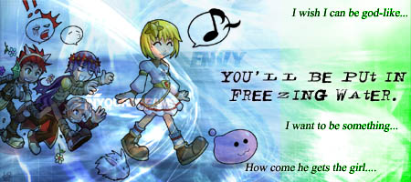
| The fifth of seven. The color contrast looks qiute awkward. The green seems out of place, but the multiplication of the 'walking water' effect seems too srtong. Self Rating: 7.65/10 |
||||||||||||||||||||
|
||||||||||||||||||||
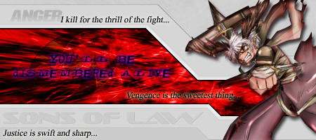
| The sixth of seven. This is one of the best within the set of seven. Simple cropping and minimal work in editing hue and saturation turned this to be pretty good. The cropping of the assassin was a bit hard. Self Rating: 9.6/10 |
||||||||||||||||||||
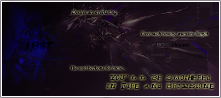
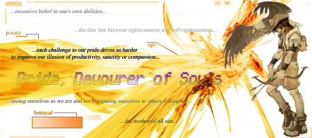
| The last of seven. This is also considered the mother of all sins. The amount of focus was not the result of the sin, as in the other signatures, but rather the beliefs and purpose of the sin. The editing of the graphics took the longest out of all in the set. This is a fine piee of work, and that it show vividness in colors. Self Rating: 9.65/10 |
||||||||||||||||||||
|
||||||||||||||||||||