 |
|
|
|
|
|
|
|
|
|
|
|
|
|
|
|
|
|
|
|
|
|
|
|
|
|
|
|
|
|
|
 |
|
|
|
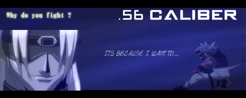
This was pretty ok to me. It was a request that wasn't answered, so I came to help. The fighter on the right works ok, and the person on the left feels like it is a ghost. Pretty good in concept.
Self Rating: 8.25/10 |
|
|
|
 |
|
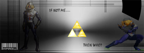
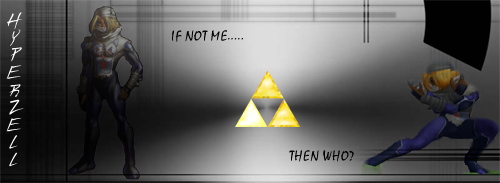
There are two of these because of one reason: the text of the person. The picture on the right was from the Super Smash Brothers game, while the one on the left was from the first N64 game. It took me a while to find which triforce was Zelda's, which I then brightened. The naming text was the hard part. Both worked perfectly to the signature. So I tried both, and sent them to the person. I preferred the top, but they liked the bottom. All and all, it worked pretty well.
Self Rating: 9.5/10 |
|
|
|
|
 |
|
|
|
|
 |
|
|
|
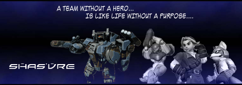
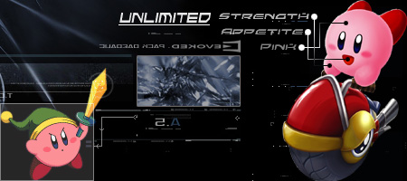
I felt somewhat unsatisfied with this one. I tried to make the four parts work harmoniously, but got nothing. So I set it as a battle squadron, with his suggested picture first. They were pleased, so I was.
Self Rating: 6.75/10 |
|
|
|
 |
|
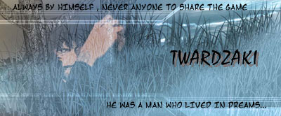
Everything here was perfect. At least the picture part. It looked like he was clinging to the tree. What got me upset was the font. I had the perfect font for this, but it was too thin, so I had to compromise with a larger font. I had to shadow the name also. It wasn't pretty, but they really liked the signature.
Self Rating: 7.75/10 |
|
|
|
|
|
 |
|
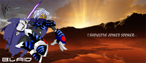
Well, in this one, I asked if I could create a type of CG from the picture requested. It turened out really well, and the background is superb to the way the character goes. The saber was new to me, but I got it to work. Everything was great, until I tried to post it, and got debugged and messed my prefect day...
Self Rating 9.5/10 |
|
|
|
|
|
This was a request's request which I took, and it ended up pretty well. I did some light rendering, some tabs, and bit of blurring, and it turned up like this. I believed that this would be something I can do later on in my signature making.
Self Rating: 9.5/10 |
|
|
 |
|
|
|
|
|
|
 |
|
|
|
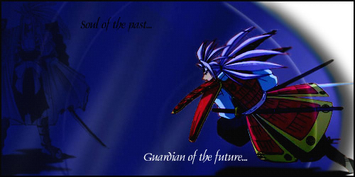
This was from a request that wanted a character from Wild Arms 3. I tried to create an 'Old Western' signature, with complimentary paper tear and burns. I am sort of satisfied, but I couldn't find the right texture for the paper.
Self Rating: 9.45/10 |
|
|
|
|
|
 |
|
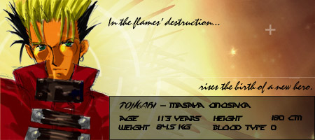
This person wanted a samurai-type warrior on their signature. What came into my mind was the really buff guy from 'Shaman King'. I tried to create a signature that is cut off from the white area, hence the white area; however, I was unable to accomplish this. Even without the effect, this is a pretty good try.
Self Rating: 9.55/10 |
|
|
|
|
|
 |
|
|
|
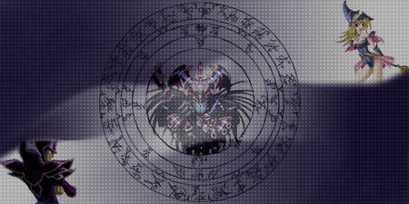
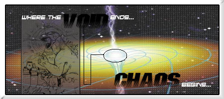
This was a request that I wanted to try out. What impressed me was the fluke that I made with the gradient background. I was playing with the smedge too, which resulted with the extremely impressive effect. This was one of the more difficult signature that I took under my wing.
Self Rating: 9.5/10 |
|
|
|
|
|
 |
|
|
|
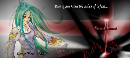
This signature was based upon the mass mulitplayer online role playing game, 'Ragnarok'. I experimented a whole lot with gradients in this signature. I also edited the artwork so that it looked like the preistess was battered and was hurting. This was a pretty good attempt.
Self Rating: 8.8/10 |
|
|
|
|
|
 |
|
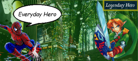
In this signature, I tried to attempt an 'East meets West' approach. With an American cartoon superhero, and the Japanese Hero of Time, it was supposed to be a good match; however the two forces mixed together made it a bit unbalanced. The merge of the backgrouund was pretty nice.
Self Rating: 8.7/10 |
|
|
|
|
|
 |
|
|
|
This signature is farmost, one of the most impresive one I made. The background was pre-made, but it had the perfect setup in my mind. With a bit of editing, it turned out to have a different aura than the rest of my signatures.
Self Rating: 10/10 |
|
|
|
|
|
 |
|
|
|
This character signature was considered as 'Junk Art'; however, mixed with the right background, and add a splash of visual effects, and you got yourself a winner. I also added a few touches that supposed to overlap the 'Humanoid Typhoon', but the strength of it was pretty weak. It still looks good anyways.
Self Rating: 9.65/10 |
|
|
|
|
|
 |
|
|
|
This was my first attempt on a fullscreen effect. This was very time consuming when you have to go through pixel by pixel in a 100x100 screen, and copying it to adjust it. After that, This lis pretty nice. This was aslo my first attemp on 'Pathguides".
Self Rating: 9.05/10 |
|
|
|
|
|
 |
|
|
|
 |
|
|
|