Self Rating: 9.75/10
Self Rating: 8.15/10
Self Rating: 9.25/10
Self Rating: 9.85/10
Self Rating: 9.8/10
Self Rating: 8.8/10
Self Rating: 9.2/10
Self Rating: 9.8/10
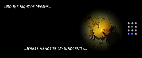
| Only one for now. I kind of liked it. It is basically innocence within dreams. Its a bit big to have so little stuff, but I sort of don't mind. Also the numbering on the side. Its not a '9', its binary coding. Top row is 8, second is 4, third is 2, and the bottom is one. The blue dots are the actual ones. It ends up to create '1' '5' '0'. Chocobo150. Self Rating: 9.75/10 |
|||||||||||||||||||||||||||||
|
|||||||||||||||||||||||||||||
|
|||||||||||||||||||||||||||||
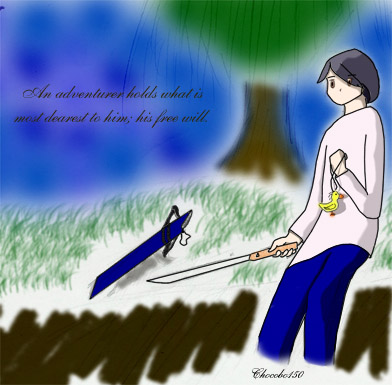
| This was a creation from my artwork, which I converted into a signature. I had to edit some of the items from my original because it looked awkward. Good for a picture, not that much good as a signature. Self Rating: 8.15/10 |
|||||||||||||||||||||||||||||
|
|||||||||||||||||||||||||||||
| This was created from an artwork that I got on the official Ragnarok Online Artwork Page. I tried to create some etched framework, and it turned out ok. Self Rating: 9.25/10 |
|||||||||||||||||||||||||||||
|
|||||||||||||||||||||||||||||
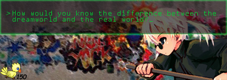
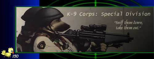
| This was supposed to be from a matrix parody artwork. The grafitti was extremely hard to find, but it worked perfectly to this situation. This is also the start of the revised 'Chocobo' logo. Self Rating: 9.85/10 |
|||||||||||||||||||||||||||||
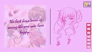
| This was supposed to be in concept of a Japanese postcard. The red boxes are like the address for it. I thought it has a very kind feeling to it. Makes me feel calm. Self Rating: 9.8/10 |
|||||||||||||||||||||||||||||
|
|||||||||||||||||||||||||||||
| This artwork was pretty cool. I cutted it out and converted into one of my wallpapers. Added a few gradients, posted in my logo, and the it was done. A quick signature, but looks pretty cool. It has a different feeling than the rest of my signatures. Self Rating: 8.8/10 |
|||||||||||||||||||||||||||||
|
|||||||||||||||||||||||||||||
|
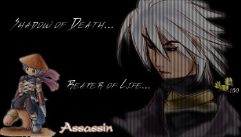
This was my first attempt on a fullscreen effect on one of my signatures. It affacted both icons on the right side. Even though the signature would have worked out ok, I added the left icon also to it. I felt that this signature needed a bit of relaxation to its tenseness. Self Rating: 9.2/10 |
||||||||||||||||||||||||||||
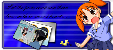
| This signature is very cute. I have tried to amplify the colors by giving opposite colors to the to most often in the signature. I also have tried to attempt to create a photo fanning effect on this. This was one of my first attempt on object shadowing. Self Rating: 9.8/10 |
|||||||||||||||||||||||||||||
|
|||||||||||||||||||||||||||||