(Return to Satisfaction Survey Page)
Profile Plots
The following graphs plot the
relationships between the independent variables (age, beneficiary group, and
purpose of visit) as indicators of the dependent variable (perception of
quality of health care received). Purpose
of visit replaces overall health status in this demonstration of graphically
plotting satisfaction survey results.
In general, the following graphs indicate that satisfaction is lower for
the urgent visits as compared to the less urgent visits. To fully appreciate this relationship, a
comparison of means (left side of each graph) should be made. An analysis of means table is not provided
in this exhibit.
MAGEGRP * MBENEGRP * PURPOSE OF VISIT
Graph 7
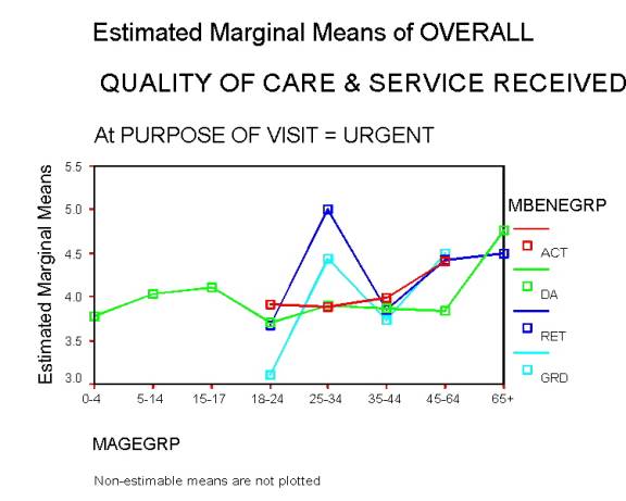
Graph 7 shows, with a few exceptions, that younger respondents were generally less satisfied with care received, as compared to their older counterparts, when the purpose of the visit was perceived as “urgent.” This relationship is most exemplified by three groups: active duty (ACT); dependents of active duty (DA); and military retirees (RET). Satisfaction increases with age, but not to the degree illustrated in previous examples. This demonstrates the importance of clearly defining variables, such as type of visit, before drawing definitive conclusions regarding perceptions of satisfaction. Specific interventions can be implemented, such as paying closer attention to the needs of the “urgent” group, in order to improve their perceptions of care received.
Graph 8
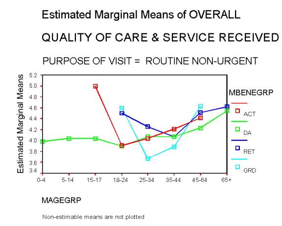
Graph 8 shows that satisfaction increases with age (for ACT, DA, and RET) when the purpose of visit was routine (non-urgent). Again, observe that some younger groups report high satisfaction, followed by decreased satisfaction, and then an increase in satisfaction with increased age.
Graph 9
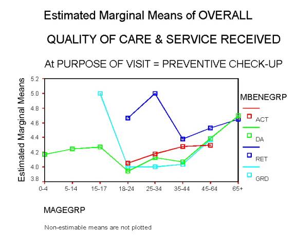
Graph 9 shows an increase in satisfaction, as age increases, starting with 18 -24 y/o respondents, when the purpose
for visit was preventive check. There is an exception to this pattern, where RET satisfaction increases starting
with the 35 - 44 y/o group.
Graph 10
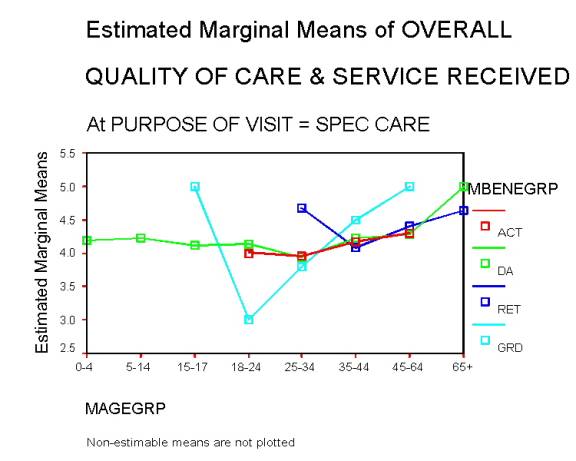
Graph 10 shows a relatively “flat” relationship between age, beneficiary group, and level of satisfaction, when the purpose of visit was for specialized care. Notice the “GRD” group. This group reports satisfaction by National Guard military beneficiaries, which sharply increases with age as compared to the other groups seeking specialized care. This can be accounted for by the fact that National Guard members do not utilize the military health system as frequently as the other groups. Further explanation of utilization frequency is beyond the scope of this demonstration.