by Yuri C
*An easy way to examine the data *
*given is by scatter plot.*
When we plot the points from the given set of data onto a rectangular coordinate graph like the one below we have a scatter plot.

For example:
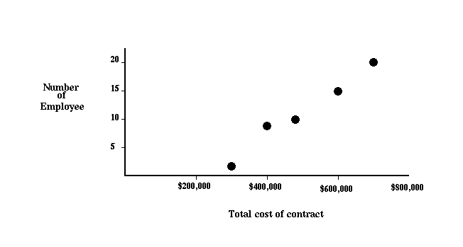
An accountant wants to know the likely cost of a new contract based on the data collected from previous contracts.
| Number of employees | Total cost of contract |
|---|---|
| 10 | $500,000 |
| 20 | $700,000 |
| 8 | $400,000 |
| 15 | $600,000 |
| 2 | $300,000 |
A scatter plot below uses the above data with the number of employees on the Y-axis and total cost of contract on the X-axis.
QUOTE:
-- Lao Tzu