


This website is a portfolio displaying some of my works. My name is David Pugh (for a while my art/brand name was Neki, as you can see from some of my signed pieces) and I am a 23-year-old graphic designer. As a designer I diligently work on all my projects to ensure the best work possible for each client. Work includes anything from advertisments, campaign materials, CSS, HTML, illustrations, spreadsheets, logos and layout designs.

This logo is something I have worked on and thought about for a while before executing in Illustrator. First, I came up with a sketch idea. After multiple designs, I decided to settle on something simpler and more whimsical. When I originally worked on designing this logo, I knew I wanted it to be for a type of restaurant; however, that slowly changed into a tea shop instead. Bubble tea is incredibly delicious! I love the fun colors in most of the stores and wished more of them incorporated the light, airy feel in their logos too! I wanted to make the logo I created fun, but also holding some sophistication to it. If I were to envision Mitsu as an actual place, I could see it as a nice hangout spot for young adults, mostly college students, and even young business workers enjoying a treat after a long day. Aside from keeping this in mind, I also wanted to keep true to the meaning of the word Mitsu. The word has different meanings, and the two that stuck out to me was the words ‘shining, bright, and tree’ all of which are rejuvenating and lively. This is showcased not only in the sleek modern design, but also in the color choices! This was fun to create and was a joy to watch the idea come to life.
Close Project
For a while I have been working on designs for cute animal characters. This is one of those creations! I wanted to make a cute, pouty cat character while still having it look adorable.
Close Project
I decided to look up some spa ads to see what I could do to update it and make it stronger! Along with the advice from my peers I figured out what to do. I wanted to keep the picture I originally had, but I changed it a lot. One thing I did, other than cropping it, was I edited it quite a bit too. I also decided to find another picture that really captured the spa vibe! Both images were edited and enhanced in photoshop, before being moved to Illustrator to finish the product. To make the text more visible, I also added an overlay over the images, and kept the text box on the bottom behind the text there. I am very happy with the result of this piece.
Close Project
For a while I have been doodling a little bunny and bear character on paper. Overtime I started to grow on that idea and the possibility of creating a story involving the adorable duo. The story is still a work in progress; however I am happy to have them designed digitally now and a color scheme for them.
Close Project
This is a piece that I did earlier on in my graphic career at SNHU. We were supposed to pick a famous designer and base a calendar from their creations. I ended up picking Milton Glaser, as he and Paul Rand are two of my favorites, and wanted to capture some of his colorful and contrasting designs. I have always been a fan of his Bob Dylan poster and that was one of the main influences with the design! I decided to completely change up the layout and took some advice from my peers and made the colors visible even between the calendar dates. Originally, I had made the boxes black and had the idea that people could write on it using a silver marker or something like that. Though, with this new idea, I adopted the original white box layout of most calendars. I wanted to keep the fun edges in my design, so I made sure to keep rounded edges, which could easily be done even on a full calendar booklet.
Close Project
While I am used to doing commissions of human characters, this one provided another challenge! The commissioner, a friend of mine named Aiden, wanted me to design a humanoid owl for him. I worked through a few designs before settling on one I liked It was fun to do and allowed me room to grow, as I attempt new and different things! I wanted to include it because I believe it is a nice showcase of my work, how it has improved, and how I am able to tackle any challenge.
Close Project
Here we have my People magazine mock-up. One of the main things I did was edit the image more to make her appear more like a vampire! That was the whole point of the original ad was to make it have a Halloween vibe. First, I did an overlay to the model’s hair and added in a red texture over it, so her hair appeared burgundy in color. Then I decided to frame her face a bit more and added in some dark blush to the top of her cheek and had it run a little. Then I darkened her eye makeup, as well as her eyebrows just to give it more of the contrasting vibe most of my other pieces have! I also edited her eye color, making them appear golden just to add to the overall theme. After finishing up editing everything, I added more of a blur around the model to bring more focus to her face, which really made her standout behind the text even more!
Close Project
I typically enjoy drawing cute characters. One of my goals was to make an adorable pony character based loosely around the My Little Pony style. It was something challenging to do in my own style, but fun nonetheless. Eventually, I settled on making a pegasus character. I really love their wings and I had this idea that they would be more fluffy and feathery, due to their life in the sky, than other types of ponies. His colors were based around the sun setting, since I wanted to keep true to his pegasus nature. He spends most of his time working during the evening, so he has seen his share of sunsets.
Close Project
Both of my tentacle prints go together as a series. It was something I worked on to come up with both a sticker design idean and a print for a shirt. I love the overall aesthetic of them, as well as the grungey look that the slime provides. They were incredibly fun to work on and I made sure to use colors that would definitely pop. The shirt colors would be either black or white.
Close Project
This is the second tentacle design I did in the series and I intend to continue adding to it as well. This one I wanted to play around with not just the movement and shape of the tentacles, but with that grungey style too. It doesn't have to be dark to be up in your face! It just needs to be creative and new. I used complimentary colors for this piece and decided to go with a more beachy vibe than I did with the other one too.
Close Project
Foxes are a part of my own personal brand identity and I always love drawing them in a number of ways. One of the mascots I use for everything is a pink fox (also located in my portfolio). The idea behind this piece was to design a fox character that could easily be put into a story, like one with bunny and bear, or his own tale.
Close Project
After working on Ebony Flame I wanted to tackle a popular character from the Pony series. She is also one of my favorites too! Rainbow Dash is a very quirky character. Her strong personality, partnered with her awesome looks, makes her a fan fave! I wanted to try a semi-realistic, semi-cartoony look for this, but still keep it sleek and clean. I really enjoyed working on the wings, and again, I worked around that idea that pegasus would be more fluffy than other types of ponies!
Close Project
Crows mean a lot to me and while the misconception of them is that they are bad omens, crows are symbolic of new beginnings and good luck! Another thing about crows is that they, along with foxes, are often two animals my significant other and I often either draw art of, buy jewelry of, or tend to find comfort in. They are representational of us in several ways, mainly due to us sticking together through thick and thin, as well as our strong bond. So, being able to include this illustration is something that I really wanted to do.
Close Project
This commission was done for someone very close to me! I wanted to try out something more intense and dramatic, that played on the emotion of the character- while also testing out some new coloring techniques! It turned out beautifully. While I am used to drawing humans, it was still a good challenge to try out a new expression and setting!
Close Project
This illustration is a piece in a series I want to start work on. I wanted to do a piece of a bunch of different albino animals, as I love the way the colors look against the black background, and have them appear to be floating in the air. This rabbit is the first of that series, and it is a piece that I am very proud of.
Close Project
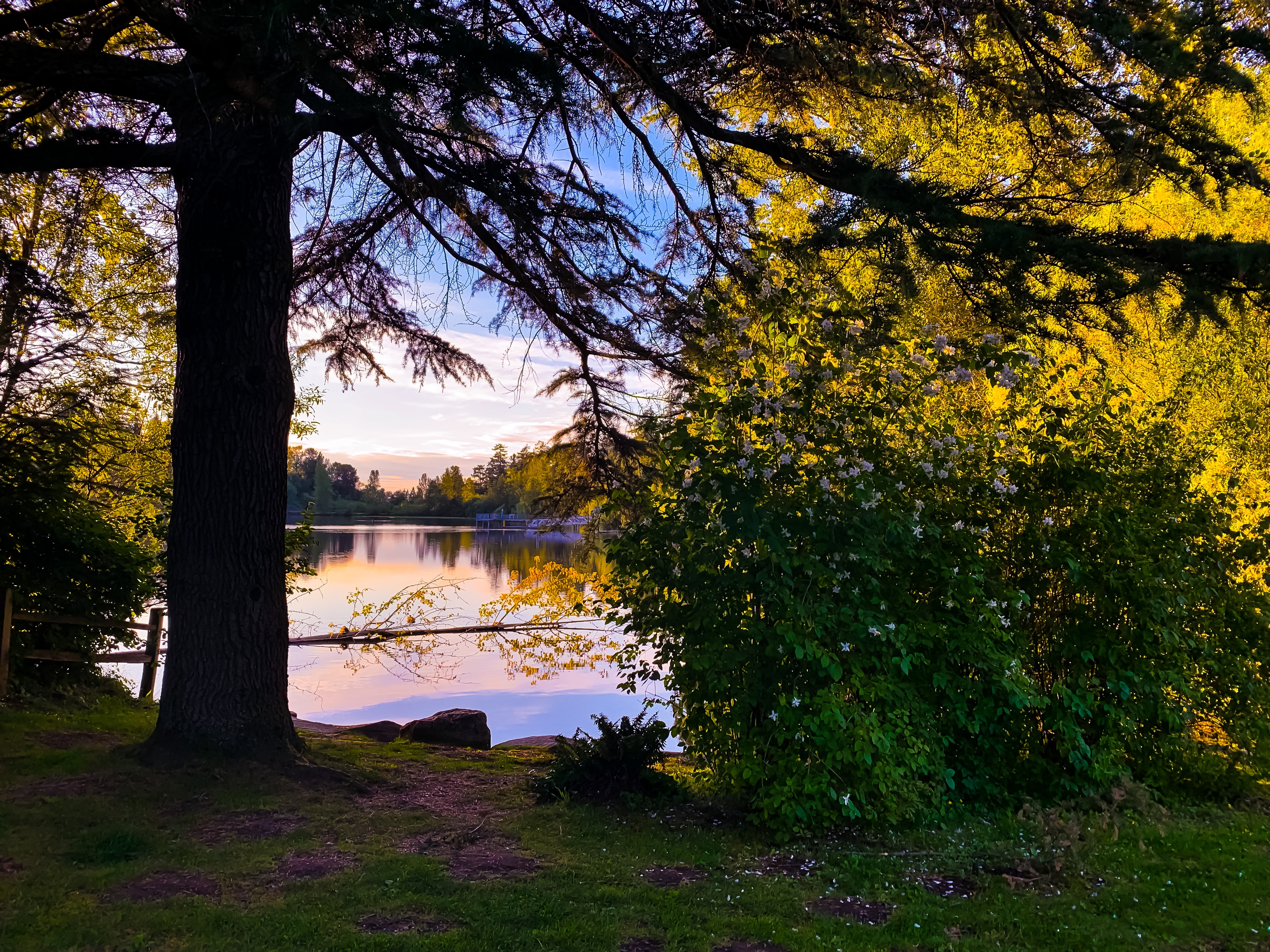
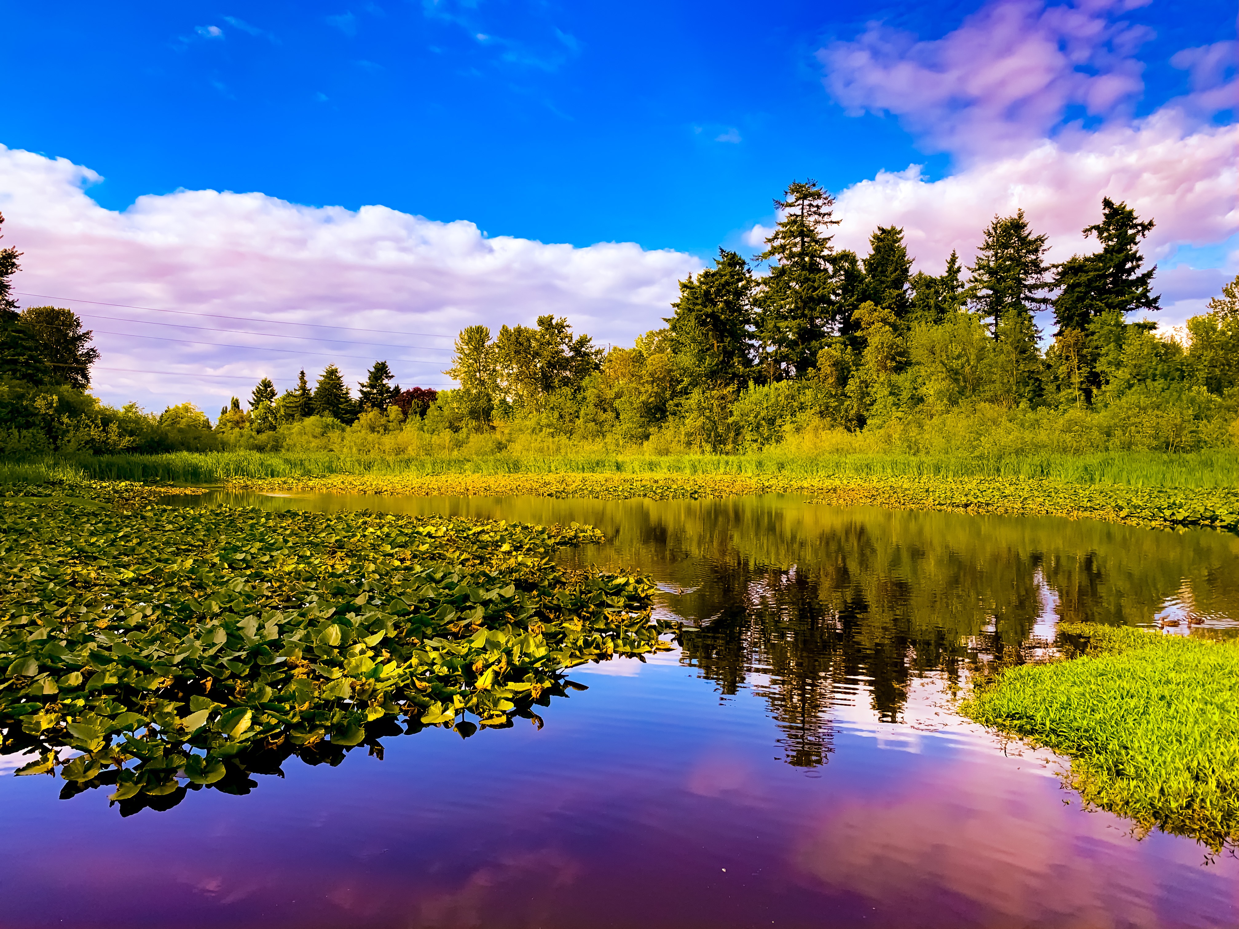
This photo, and the others following it, are a set that belong together. I wanted to do a short story with them that captured the aesthetic of a 'fairy garden' or 'enchanted garden' of sorts. All of these images were taken and then edited by me. They came from the same location, but at different times of the day and during different days of the week. The idea started with one of the images and grew from there. I am currently still adding to this collection, and hope to make a mini narriative with the pieces.
Close Project
As explained in the first image of this set, these photographs are part of a narriative piece I am consturcting. It is about an enchanted forest, a place where fairies gather, among other magical beings. I wanted to not only display the beauties of nature, but also leave the images with an open-ended fantasy feel. All of these pieces allow the viewer's mind to wander, as well as allowing them to come up with their own amazing tale of the magical place.
Close Project
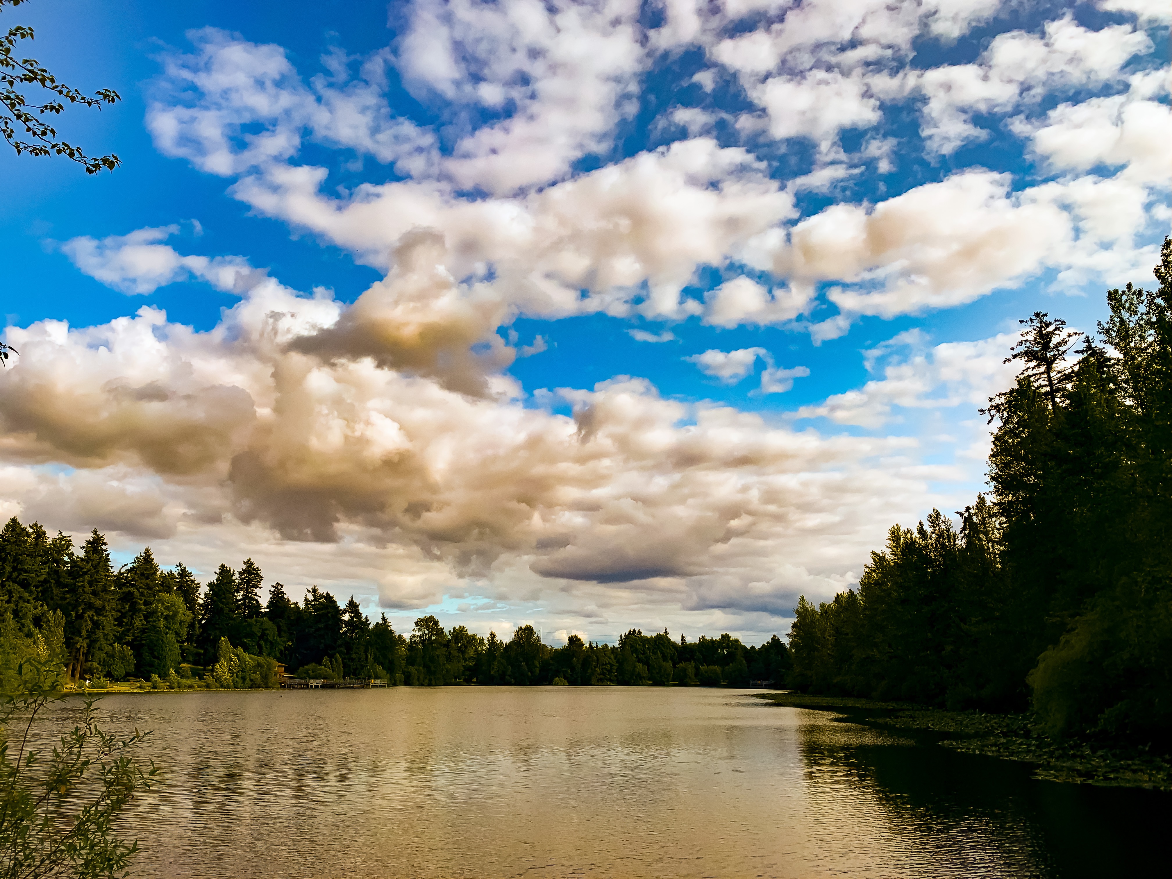
While this is still a work-in-progress photography narrative, I wanted the last piece to leave the viewer satisifed, as if they were an adventurer heading off to a new, exciting place, after making friends with all the magical creatures that live in this lovely forest. I wanted it to showcase the water a bit more, and make it appear as though they have overcome many trails in the woods, and made it across the lake to a new piece of land! This may be a beautiful farewell; however, it is the start of a new, exciting journey!
Close Project