Roster Banners
Victoria Callaghan
There's many different types of roster banners for e-fed's. When you're creating an e-fed you want to decide which type and design is right for your fed, not to mention colors. Some fed's I've been in let the handlers make the banners and send them in themselves, if this is like your e-fed, then this isn't for you unless you want a quick lesson on roster banners.
When creating a roster banner, you want to take into account the size of the window that it will be appearing in, this pertains mostly to sites using frames. If the banner is too wide, then all of it can't be seen and some of the effect is lost.
You don't want a banner that has too much blank space on it, like so:
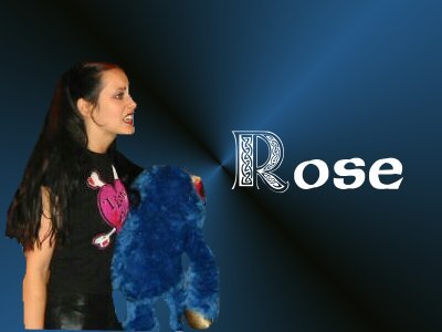
The following three are basically the same as the one above, one picture of the e-wrestler and the name, but having the banner smaller makes it look neater and more professional, not to mention less boring.
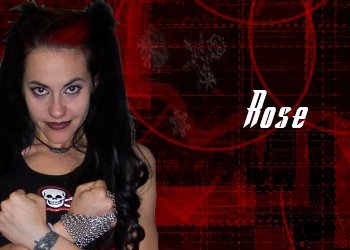


Those three are about as simple as roster banners come, they're easy to create and look good. Basically anyone can create one using PSD's and a background that can be found on graphics sites, pending that you make sure that a link is given for the borrowed graphics.
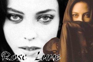
The next three are all basically the same with subtle differances. The first one has a background behind it, the second one is just a picture and the third is a close-up. All three are also easy to do as well, PSD's and backgrounds are really all you need, and I use PSP to tint the pictures. No real design professional is need, the design is simple enough but not too busy for the size of the banner.


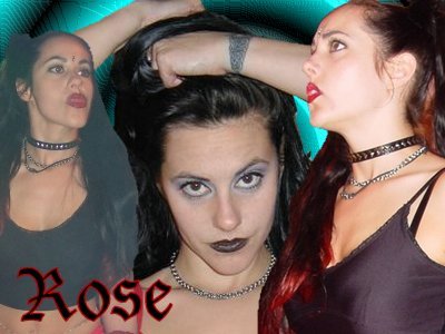
These two are less simple. Three pictures are used and a sense of graphical balance is needed, if not it could end up looking lop-sided and un-appealing to the eye. If you're not all that talented with graphics, you might want to go with the simpler designs.

The last one is one that I had finished creating only a day ago to full an order. It's to be used in an e-fed that has the handler send in the banner for the e-wrestler.

Design is a big element here, you have to know what colors can be matched, what pictures and what sizes look good together and the limit of how much you can tweak pictures without it looking too trashy. I had the front image blurred out and a white border put around it, any more then that and the banner would be too busy.