 |
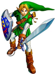
For this one, I needed a visual aide, without actually playing the game, this was the main picture that I used. I'm also posting this for an idea of what Link looks like for those that are unfamiliar with the series. I did, however, end up playing the game, and drawing it from there at some parts. |
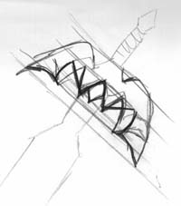 |
This is the second hilt that I sketched. It was used to get an idea of proportions, angles, and lengths. Easily noted, the guidelines are there for lengths. As it is, for what change happens to one side, the other side is also changed, since both halves are mirror images of each other. |
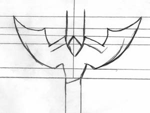 |
As mentioned before, since each half are mirror images, a center line was added in this one, for length reasons. With the horizontal lines also used as aids, with the two, coordinates, per se, are formed. This is obviously more fine-lined than the previous one. |
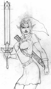 |
This is the final pencil sketch. As usual, all done in #1 pencil. This was the hardest step of the series. Or more percisely, being faithful to the original. The major change was the "handiness." Link is left-handed, but I am right-handed.
The Master Sword was intended to be the most important part of the picture, so much study went into that, as shown with the sketches of the hilts.
For the record, I have never drawn a picture like this, and though I intended to make myself look angry, I had no idea it would turn out this way. When I finished the eyes (the first thing I did), I decided to go all out.
If you examine the left arm, you will see that there were bands there. I was originally going ot ad a shield, but decided against it since I didn't really care on studying that as I did for the sword. Moreover, I didn't have a good picture of the sheath, but I knew it's general color pattern, so I made up my own designs. |
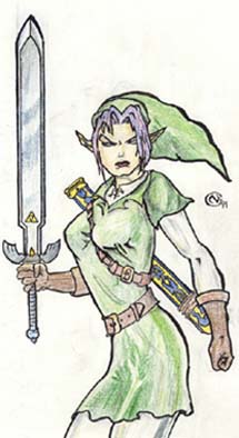 |
I haven't done inking in a while, but I brought it back because I deemed it neccessary for this one. It took a while before I could get my skills back though. Because the blade demanded straight lines, an ink pen was used for that.
Coloring, same deal as usual, just need to have a good fram on lighting. Only color pencils were used.
|
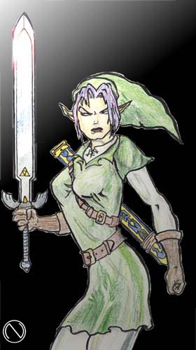 |
Now, a simple bit of computer graphics were implemented. The first task was to get all the white space to become transparent (the most tedious part). Then, a gradient from white to black, as seen on the top-left corner, which was put as the background. A lens flare for that special touch in the blade, then some lighting effects in the foreground, then BAM! Sure, some of the brilliant colors were lost, but worth it!
Heh, let's if anyone wants to spar with me NOW... |